The colors gray and gold go together like the metallics silver and gold to create a classy-looking interior space that is restful and serene, yet never dull. Begin with the large areas of your space -- the walls, ceiling and floor tones -- and tie the scheme together with fabrics and accessories.
Gray and Gold Wall Colors
Video of the Day
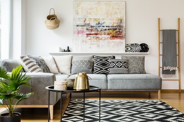
Gray walls create a quiet, neutral backdrop for furnishings and accessories. The color gray may lean toward warm neutrals like taupe or cooler neutrals like pewter; the choice is yours. Cool shades of gray have hints of blue or green tones, which coordinate well with blue- and gold-patterned furniture, rugs and accessories. Dark grays, such as anthracite, make the gold accents "pop" against the deeply colored walls.
Gold-toned walls produce a different effect -- whether pale or deep, the room has a glow similar to sunlight. Gold is always a warm hue, ranging from subdued tan to vibrant goldenrod. The warmth of a golden color gently balances the coolness of gray, and the energy of gold balances the peacefulness of gray, making them ideal companion colors.
Bare Floors or Carpet
Floors contribute large color areas in a space, and bare wood floors with a golden finish look stunning in a room with gray walls, especially when the woodwork trim is painted white. Enliven carpet in a pale gray tint with gold-toned fabrics and furniture upholstered in gold. Area rugs in gray and gold patterns help pull together the dominant colors in the color scheme.
Ceiling Color and Tints
Check out your ceiling color. A pale tint of the wall color on the ceiling subtly helps connect walls, floors and ceiling. With a deeply coffered ceiling you can use a darker tone of the wall hue to produce a striking effect.
A pale gray with a hint of blue gives the ceiling a sense of receding, like the sky. This illusion helps make the room feel like it is larger with higher ceilings. A light-colored ceiling that incorporates a hint of gold brings in the light and subtle warmth of the sun.
Fabrics Make the Connection
Patterned fabrics in gray and gold, gray and white, gold and white or gray, gold, and white tie together the walls, floors and ceilings colored in similar tones. Gold or gray window fabrics that have a silky shimmer also relate to the color scheme. Heavier, more opaque fabrics provide textural contrast on upholstered pieces. Fabrics with a metallic thread woven through them subtly spark up the neutral color scheme of gold and gray.
Accent With Art and Accessories
Works of art that incorporate gold and gray help relate the two dominant hues in the color scheme, especially when presented in sparkling gold or silver frames. Accessory pieces in metal also accentuate this color scheme.
Touches of metallic gold or silver contribute to an effect of sumptuous style. A deep gray wall hung with a collection of shiny gold-framed art and decorative accents looks elegant and sophisticated. The flatness of gray seems to heighten the shine of metallic gold, whether the frame is a simple modern style or an ornate antique.
Surrounding walls in a tone of gold produces a similar effect on pewter or chrome. In general, chrome frames are found in simple, modern styles that pull the eye to the art. In addition to decorating with art, whether paintings or sculptures, a touch of gilt or gold leaf on a piece of furniture pulls the eye around the room and creates a stylish accent.