Yellow in its pure form can be bitingly intense. It can also be warm and soothing when tempered. Some colors are literally complementary to yellow, meaning that they are opposite yellow on a color wheel; other colors complement yellow in the sense that they work harmoniously.
True Complements
Video of the Day
The true complement, in the sense of color theory, to an ideal yellow is purple. Purple lies across the color wheel, and when the two colors are blended, brown results. Move the yellow a bit toward green, and the complement moves accordingly to a red-purple. If a yellow is greenish, the complement is blue-purple. These complements create dynamic color impact.
Video of the Day
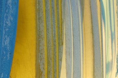
Contrasts for Bright Yellows
In addition to the color theory complements, other contrasts that harmonize with yellow are options. For instance, ultramarine blue is a classic match for yellow and is seen on fine ceramic dishes and platters. A lighter, Mediterranean blue pairs with bright yellow for a typical Provencal kitchen color theme. Deep moss green and similar green hues make a less contrasting but lovely harmony.
Matching Pastel Yellows
Pastels contain white. Thus, a pastel yellow, like a lemon ice hue or similar paler yellow, is quite bright but does not have the intensity of pure yellow. Pastels go well with other pastels. A pale, pastel purple is a bold match but also keeps a color scheme light and not overbearing. A bronze hue is a darker match that provides more light or dark contrast. It also picks up the warmth of the yellow hue.
Neutral Yellow Matching
More neutral yellows, like ocher or marigold, provide a wealth of options. The neutral hues naturally pair with a wide palette. For warm ochers choose chocolate for a rich, dark option and select a dark magenta for more power. For a more saturated marigold color, adobe, pumpkin and butterscotch offer soft support that complements the yellow tones in the marigold.