Melon Method Decluttering: How to Style Shelves Calmer
Imagine a shelf holding the same ten objects on Monday and Friday, tidy at the start of the week, chaotic by the end of it. Nothing was added. Nothing was removed. Only the spacing changed. That's the logic behind Melon Method decluttering, a way to make your home look less cluttered without decluttering, built on a real design principle, negative space, and made concrete with an object you can hold in your hand.
This isn't decluttering in the usual sense. It won't shrink the pile of things you own. What it does is fix how a surface reads through grouping and proportional gaps, the "melon" standing in for how much empty space a display needs before it feels intentional instead of crammed. Clutter is often a scale issue before it's a quantity issue, according to Edward Martin: a handful of small objects crowded together can read as busier than one substantial piece with a clear silhouette. Work with that idea and you may not have to remove anything to make a room look less cluttered. You just have to change how the eye moves across what's already there. In short, this is styling decor to reduce visual clutter, not an inventory count.
Designer Jonathan Adler frames his own decor in similar terms, describing groupings as "islands" surrounded by "a little moat of clean, blank space," and calling negative space a "decorator's secret weapon" rather than an afterthought (The Seattle Times, 2024). Negative space and the objects sitting in it work in dialogue: the gap between things gives the eye a pause, which helps the objects themselves stand out (Livingetc, citing Erica McLain, last year).
One limitation is worth stating before anything else: this only works if there's somewhere for the overflow to go, a drawer, a closet, a bin. If a surface is packed with things used daily and there's nowhere else to put them, rearranging won't fix that. That's a storage problem, not a spacing one, and it's worth ruling out before deciding the method has failed you.
What the Melon Method actually is (and isn't)
Video of the Day
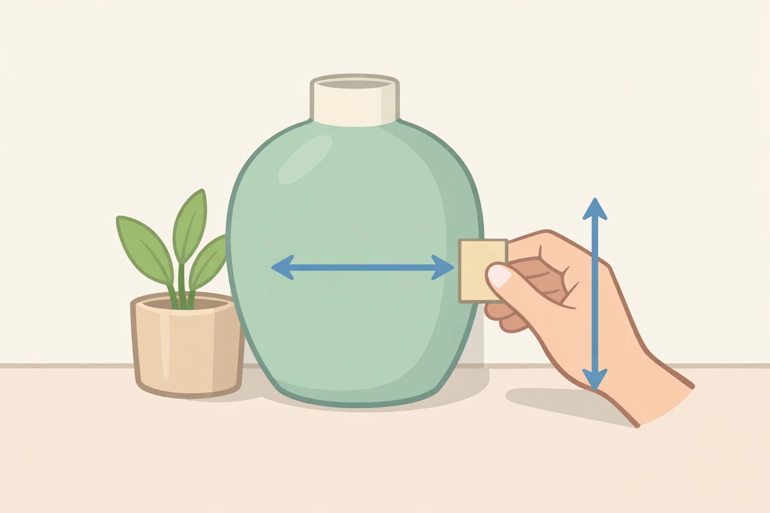
The melon itself isn't a designer term or a measured standard. In this guide, it's a practical substitute for a proportional gap, something you can hold up next to your largest displayed object to judge whether the space around it is doing its job. There's no universal percentage of empty space that works in every room, which is exactly why a physical placeholder helps more than a rule of thumb (Edward Martin, earlier this year).
New York designer Ksenya Malina builds one grouping on a tabletop, leaves blank space around it, and only then decides whether a second arrangement belongs nearby (The Seattle Times). That's the principle this guide borrows. The melon-width gap, measuring the space between clusters with a spacer roughly the size of your biggest piece, is this guide's own way of applying that principle, not something Malina or anyone else cited here specifies.
The goal is a surface that feels deliberate, not sparse, and not stripped down for its own sake (Edward Martin). This method changes how a surface reads, not how much you own, and that boundary matters more than the metaphor.
Video of the Day
How to reduce visual clutter without getting rid of things
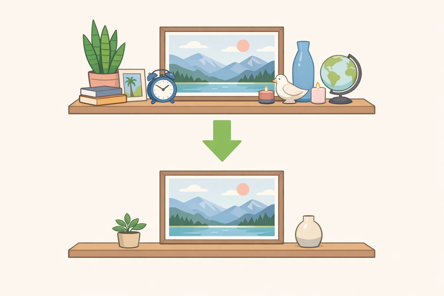
You'll need one cleared surface to work on and a spacer roughly the size of your largest displayed object. A melon works. So does a mug, a book, or a small vase.
-
Clear the surface completely, and pull aside anything that has to stay accessible, mail, keys, the tools you use daily. What's left is what you're actually styling. Seeing the bare shelf or counter, its shape, finish, and proportions, makes it obvious how much room you're working with before anything goes back (Edward Martin). If the functional items alone already cover most of the surface, spacing won't fix that. It means you need more storage elsewhere, a different daily routine, or an actual editing pass, not a rearrangement.
-
Pick one focal point. Choose the object with the most visual weight and clear away whatever competes with it. Designers use this to avoid visual overload across a room, choosing one focal point per room and removing distracting elements around it (The Seattle Times). For a smaller zone, adapt that same principle: pick one dominant object per display area rather than one per room.
-
Cluster what's left into one or two groupings instead of lining everything up evenly. It's the same instinct behind Adler's islands, decor gathered with blank space around it (The Seattle Times), scaled down to a single surface. A grouping is getting too dense if silhouettes start to overlap, if several objects of the same height form a flat line, or if small pieces are visually competing with the focal point instead of supporting it. If there's no bare surface visible between two objects, that's usually the signal to split the grouping rather than add to it.
-
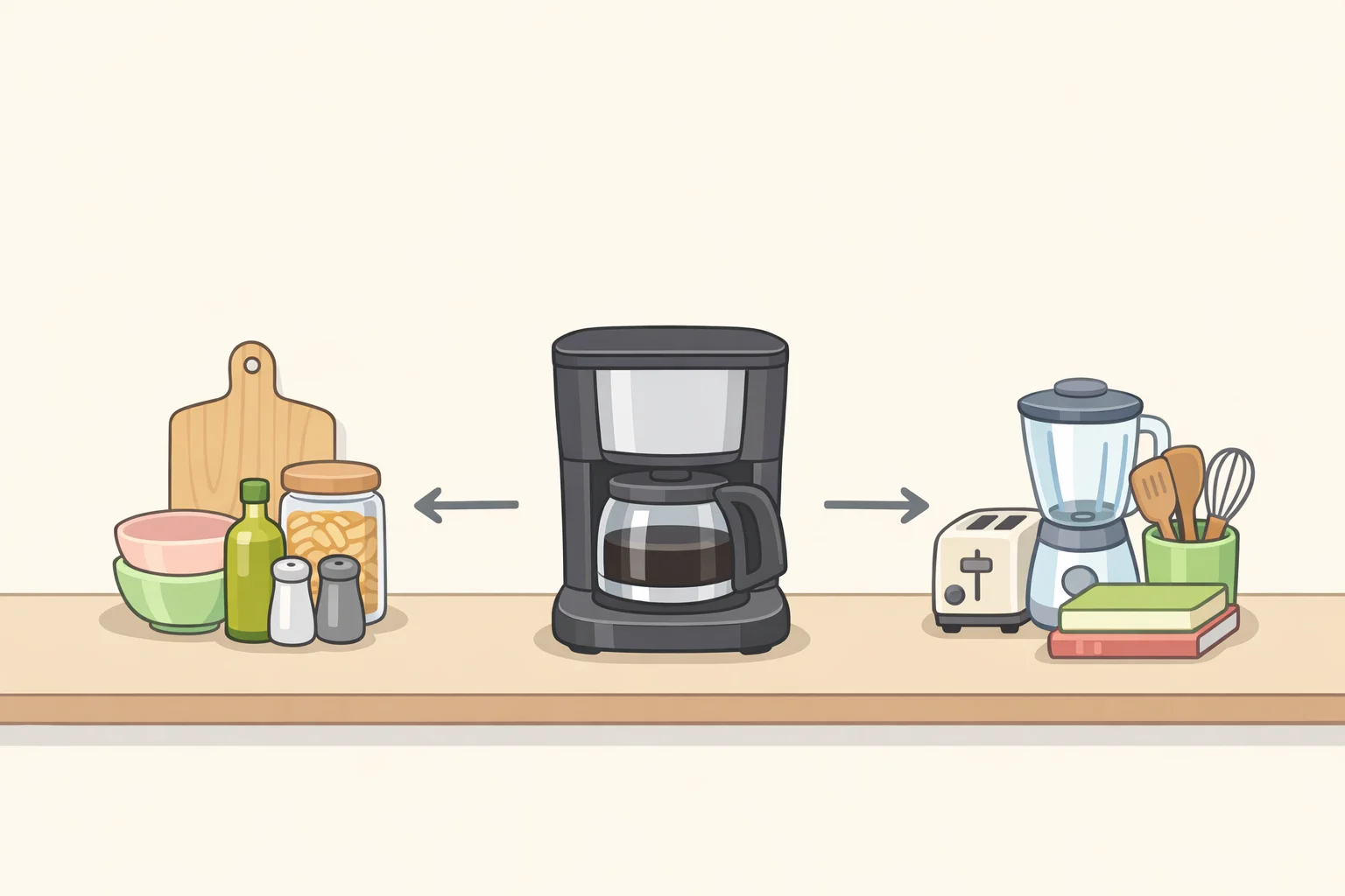
Leave a gap between groupings, roughly proportional to your largest object. This is the melon step: hold your spacer against your biggest piece and use that width as a rough test for whether there's really a break between clusters. Malina's approach supports the principle, she waits until there's clear space around one arrangement before adding another (The Seattle Times), but the melon-width measurement itself is this guide's own shorthand. On a kitchen counter, that might mean clustering a cutting board and utensil crock at one end, leaving a visible gap, then placing the fruit bowl on its own rather than lining all three up together. Not every grouping needs a partner. If the first cluster already takes up most of the usable width, leave the rest of the surface empty instead of forcing a second island just to fill it.
-
Run the one-item removal test. Once a grouping feels finished, pull one piece out. If the rest becomes easier to see, the surface was carrying too much. If the arrangement suddenly feels unresolved, put the item back; it was providing balance (Edward Martin).
-
Relocate what fails the test, rather than deciding on the spot whether to keep it. Anything that fails on every surface goes into a drawer, bin, or nearby closet for now. It's the same relocate-rather-than-remove logic professional organizer Michelle Parravani recommends for entryway overflow: move coats and shoes to a hallway closet instead of styling around a daily pile (Homes & Gardens, last year). Try a one-week holding period before deciding what to do with whatever lands there; that's a starting point worth testing, not something Parravani prescribes. If the same three items keep showing up in the holding zone across multiple surfaces, that's useful information. It's probably time for a real editing pass, not proof the method failed.
How to make a room look less cluttered when everything is functional
Every room reaches a point where nothing left on the surface is optional, and that's where grouping and gaps stop working on their own. The fix looks different depending on the room.
Kitchen counters. Creating negative space around the coffee maker or knife block restores usable counter space and cuts down on what one source describes as stressful visual clutter in a kitchen already crowded by daily-use items (Homes & Gardens). The tools stay put. What actually gets grouped or relocated is the overflow around them, the extra gadget, the mail that landed there instead of the counter's real job.
Open shelving. Before restocking a shelf, Parravani suggests a gut check: does leaving part of it empty bring a small sense of calm (Homes & Gardens)? That question is most useful on shelves that tend to accumulate rather than display, the ones where every open inch gets filled within a week of clearing it.
Entryways. Coats and shoes aren't decor, and no amount of grouping turns them into a styled vignette. Parravani's fix is relocating the overflow to a hallway closet, which in practice frees the entry table for one intentional grouping instead of a daily pile (Homes & Gardens).
Living room tabletops. Designer Julie Anne Burch designed an entire home around balancing "ample seating for entertaining" against "a sense of spaciousness" (Livingetc, last year), a reminder that negative space has to serve how a room gets used before it serves how it looks. Applied to a single console table, the same idea holds: settle what the surface needs to do before deciding how to style it.
Why this isn't the same as minimalism
Clutter-free styling isn't about stripping away personality. It's about giving what you keep enough room to actually be seen (Edward Martin). Neither an empty room nor an overfilled one is the design goal; the same grouping-and-spacing logic can work in a maximalist home just as it can in a minimalist one (Livingetc).
Adler's own advice, once the islands are established, is to decorate them enthusiastically with pieces that spark joy and conversation (The Seattle Times). The empty moat around a grouping exists to support the display, not replace it. Restraint is what makes objects read as chosen rather than accumulated, which is the whole point of doing any of this.
Where this leaves you
Clear the surface, choose a focal point, group what's left, leave a gap sized to your biggest piece, then test by pulling one item out. Done consistently, that sequence can make a cluttered-looking surface calmer without anything leaving the house for good.
Treat all of this as a starting point rather than a guarantee. The advice above comes from designers and professional organizers describing what's worked in real homes, not a controlled study, so test it on one shelf before assuming it holds everywhere else.
The distinction worth carrying forward is simpler than any of the steps above. Visual overload can be driven by scale before quantity (Edward Martin), which is exactly why styling works as often as it does. Style first when the problem is density, when a shelf just looks busy. Declutter or fix the storage when the problem is capacity, when there's genuinely nowhere else for the stuff to go. This method handles the first case well. It was never built for the second.