ehow
Home Sweet Home
Hacks, Tips & Tricks
Squeaky Clean
DIY Decor
Carpentry & Remodeling
Maintenance & Repair
Green Thumb
All Home Sweet Home
Chow Down
Main Dishes
Sweet Treats
Snacks
Copycat Recipes
Drinks & Cocktails
Sides & Appetizers
Veggie Faves
Food Hacks
All Chow Down
Get Crafty
Sew Simple
Fun Crafts
Art Projects
All Get Crafty
Let’s Celebrate
Valentine's Day
St. Patrick's Day
Easter
Mother's Day
Father's Day
4th of July
Back to School
Halloween
Thanksgiving
Christmas
New Year
Weddings
Baby Showers
Birthdays
Parties & Events
Gifts
All Let’s Celebrate
JOIN OUR NEWSLETTER
JOIN OUR NEWSLETTER
Featured Project
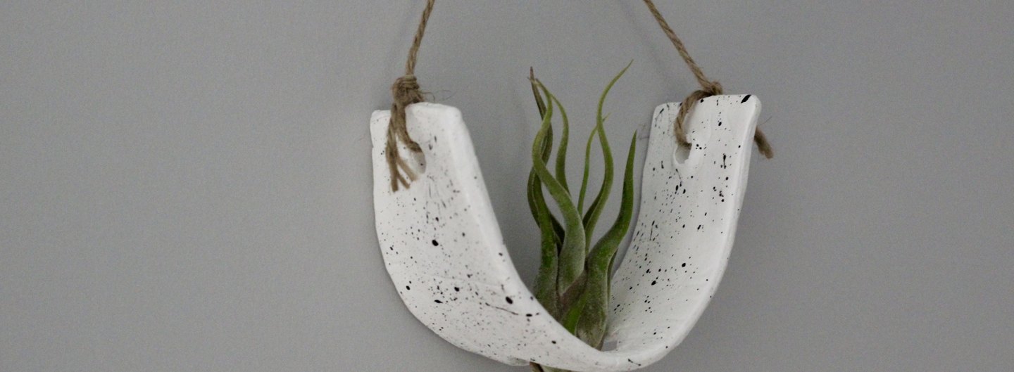
DIY Air-Dry Clay Plant Pots
Advertisement
Featured
By
Sharon Hsu
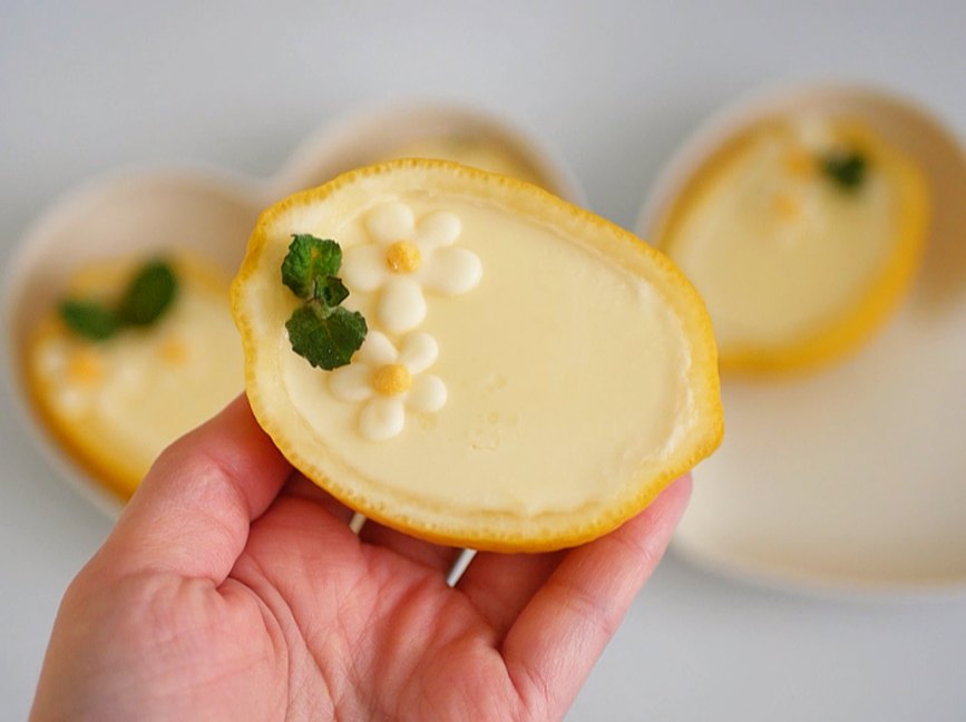
Lemon Posset
Chow Down
By
Teo Spengler
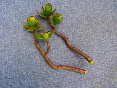
How to Propagate Jade Plants
Home Sweet Home
By
Kirsten Nunez
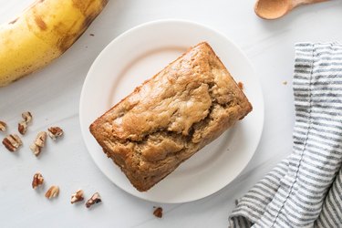
Baking for One — Banana Bread
Chow Down
By
Jessica Kielman
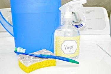
How to Clean a Top-Loading Washing Machine With Natural Ingredients
Home Sweet Home
By
Kirsten Nunez
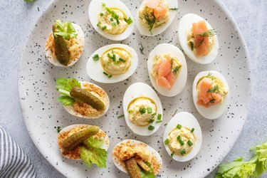
Devilish Deviled Eggs (3 Ways)
Chow Down
DIY & How-To Everything
By
Beth Huntington
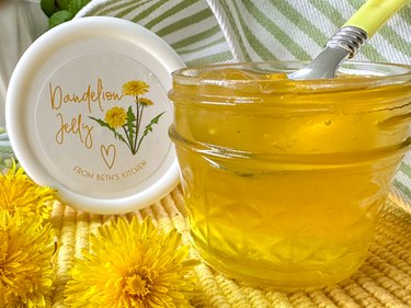
Delicious DIY Dandelion Jelly
Chow Down
By
Bianca Fernandez
Cookies That Say 'Love You, Mom!' — Vanilla Shortbread Hearts Dipped in Chocolate
Let's Celebrate
By
Kalia Silva-Phillips
Mom's the Bomb! DIY Bath Bombs
Get Crafty
By
Teo Spengler
Houseplant Help: Mother of Thousands Plant (Kalanchoe)
Home Sweet Home
By
Kirsten Nunez
Carrot Cake Pop Tarts
Chow Down
By
Isabelle Lopez
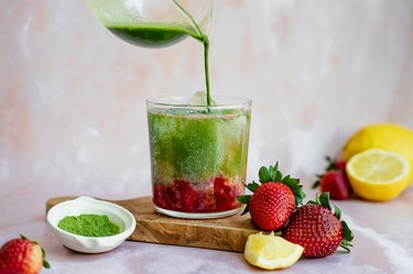
Iced Strawberry Matcha Lemonade Fizz
Chow Down
By
Isabelle Lopez
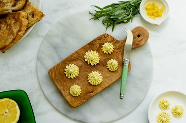
Elegant Tarragon-Lemon Compound Butter Rosettes
Chow Down
By
Contributing Writer
Graduation Gift Ideas for Every Type of Grad
Let's Celebrate
By
Sharon Hsu
Orange Panna Cotta
Chow Down
By
Lauren Murphy
Mother's Day Gift Ideas for Every Kind of Mom
Let's Celebrate
By
Teo Spengler
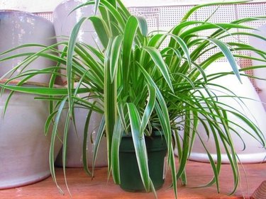
Houseplant Help: Spider Plant (Chlorophytum comosum)
Home Sweet Home
By
Kalia Silva-Phillips
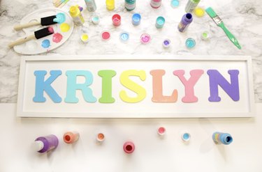
Custom-Painted Wood Wall Letters
Home Sweet Home
By
Sharon Hsu
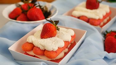
Strawberries and Cream Tiramisu
Chow Down
By
Elba Valverde
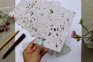
How to Make Seed Paper
Get Crafty
By
Kirsten Nunez
Baking for One — Carrot Cake
Chow Down
By
Beth Huntington
Easy DIY Stretchy Twisted Headband
Get Crafty
By
Kirsten Nunez
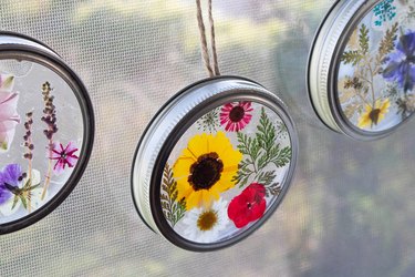
Upcycled Flower Suncatchers
Get Crafty
By
Beth Huntington
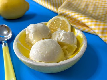
Homemade Fresh Lemon Ice Cream
Chow Down
By
Teo Spengler
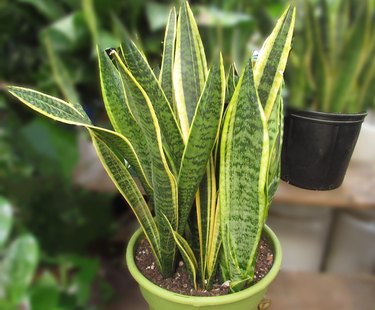
Houseplant Help: Snake Plant (Dracaena trifasciata)
Home Sweet Home
By
Sharon Hsu
Fancy Chocolate-Covered Oreos
Chow Down
By
Kalia Silva-Phillips
DIY Shrinky Dinks Craft
Get Crafty
By
Elba Valverde
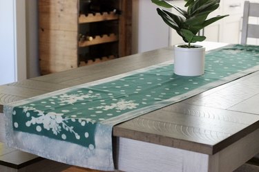
How to Do Bleach Art—and Make a Table Runner
Home Sweet Home
By
Teo Spengler
Houseplant Help: Peace Lily (Spathiphyllum)
Home Sweet Home
By
Sharon Hsu
Daisy Meringue Cookie Pops
Chow Down
By
Beth Huntington
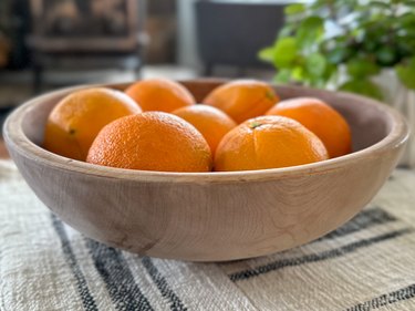
How to Bleach Wooden Salad Bowls and Other Thrift Finds
Home Sweet Home
By
Kirsten Nunez
Baking for One — Oatmeal Cookie
Chow Down
By
Teo Spengler
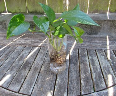
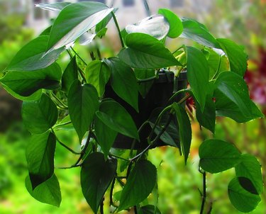
How to Propagate Pothos
Home Sweet Home
By
Kirsten Nunez
Vegetarian Guinness Stew
Chow Down
By
Bianca Fernandez
Cream Cheese and Fruit Pastries
Chow Down
By
Beth Huntington
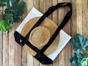
Sun Hat Tote Bag
Get Crafty
By
Beth Huntington
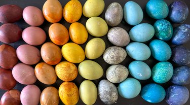
How to Dye Easter Eggs With Natural Egg Dyes
Get Crafty
By
Kirsten Nunez
Baking for One — Brownie in a Mug
Chow Down
By
Sharon
Peeps Sugar Cookies
Let's Celebrate
By
Sharon
No-Bake Chocolate Coconut Bird's Nests
Let's Celebrate
By
Kirsten Nunez
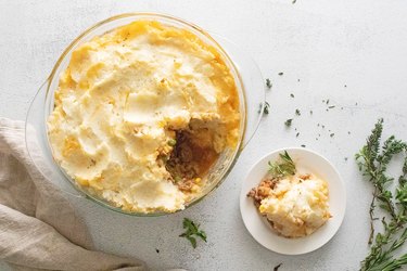
Cottage Pie
Chow Down
By
Teo Spengler
What to Plant In Your Garden In Early Spring
Home Sweet Home
By
Elba Valverde
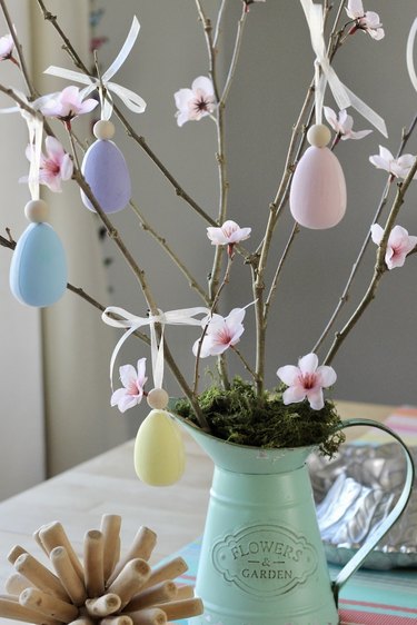
Easter Centerpiece
Let's Celebrate
By
Bianca Fernandez
Sourdough Discard Waffles and Pancakes
Chow Down
By
Sharon
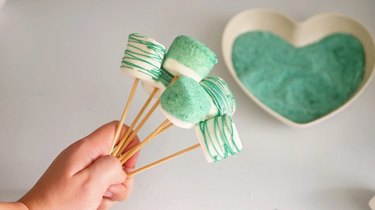
Dipped Marshmallow Pops
Chow Down
By
Bianca Fernandez
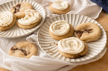
Cinnamon Roll Cookies
Chow Down
By
Kirsten Nunez
3 Pudding Cups With Girl Scout Cookie Crusts
Chow Down
By
Beth Huntington
Pi Day Bracelets
Get Crafty
By
Kalia Silva-Phillips
Stanley Cup Glow-Up
Get Crafty
By
Beth Huntington
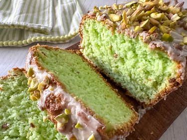
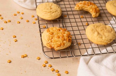
Pistachio Bread
Chow Down
By
Sharon
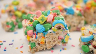
Lucky Charms Cereal Treats
Chow Down
By
Sharon
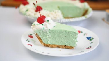
Shamrock Shake Pie
Chow Down
By
Damarys Ocaña Perez
Meet Isaac Dushku — Lord of Maps
Get Crafty
By
Teo Spengler
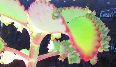
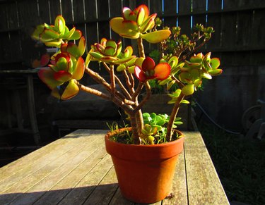
Houseplant Help: Jade Plant (Crassula ovata)
Home Sweet Home
By
Kirsten Nunez
How to Make Ramen Better: 3 Easy Ramen Noodle Meals
Chow Down
By
Teo Spengler
Houseplant Help: Golden Pothos (Epipremnum aureum)
Home Sweet Home
By
Kirsten Nunez
Chickpea Snack Mix
Chow Down
By
Sharon Hsu
Love Letter Cookies
Let's Celebrate
By
Bianca Fernandez
Chocolate-Dipped Strawberries for Valentine's Day
Let's Celebrate
By
Teo Spengler
Houseplant Help: Dracaena fragrans (Corn Plant)
Home Sweet Home
By
Kirsten Nunez
Hawaiian Meatballs — '70s Party Classic
Chow Down
By
Beth Huntington
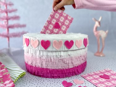
Best-in-Class DIY Valentine Box
Let's Celebrate
By
Beth Huntington
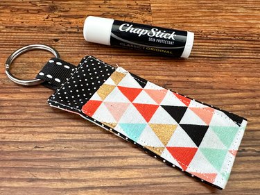
Fabric Lip Balm Holder
Get Crafty
By
Kathryn Walsh
How to Make a Custom Cleaning Calendar for 2024
Home Sweet Home
By
Teo Spengler
New USDA Plant Hardiness Zone Map — What's Your Zone Now?
Home Sweet Home
By
Kirsten Nunez
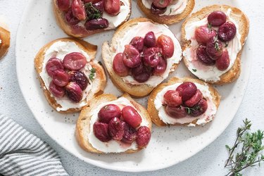
Roasted Grape and Mascarpone Toasts
Chow Down
By
Sharon
Heart-Filled Chocolate Cupcakes
Chow Down
By
Bianca Fernandez
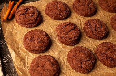
Chocolate Snickerdoodles
Chow Down
By
Bianca Fernandez
Easy Sugar Cookie Bars
Chow Down
By
Damarys Ocaña Perez
Kalejunkie: The Power of a Good Meal
Chow Down
By
Kirsten Nunez
New Year's Eve Hot Cocoa Bombs
Let's Celebrate
By
Kirsten Nunez
New Year's Eve Earrings
Let's Celebrate
By
Kirsten Nunez
Pink Tinsel Party Crackers
Let's Celebrate
By
Bianca Fernandez
Chocolate-Dipped Strawberries for New Year's
Let's Celebrate
By
Bianca Fernandez
Dazzling New Year's Sugar Cookies
Chow Down
By
Kirsten Nunez
Candy Land/Gingerbread Holiday Slippers
Get Crafty
By
Beth Huntington
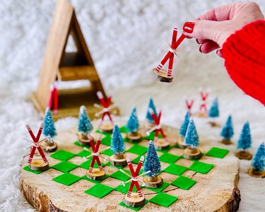
Ski Chalet Checkerboard
Get Crafty
By
Kathryn Walsh
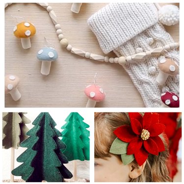
A Very Felt Christmas
Get Crafty
By
Kirsten Nunez
Soaps Inspired by Holiday Drinks
Let's Celebrate
By
Kirsten Nunez
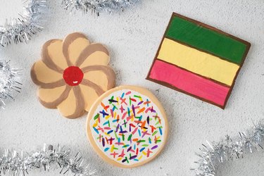
Italian Holiday Cookie Coasters
Get Crafty
By
Kathryn Walsh
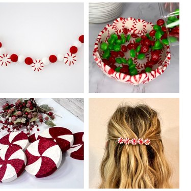
Trend Report: All Things Peppermint
Home Sweet Home
By
Damarys Ocaña Perez
Char Miller-King Is Changing Woodworking Perceptions
Home Sweet Home
By
Sophie Katzman
A Cute & Colorful Alphabet Cake for All Ages
Chow Down
By
Kathryn Walsh
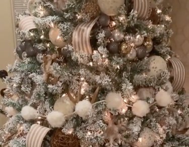
9 Christmas Tree Themes for Festive Inspo
Let's Celebrate
By
Kirsten Nunez
"Bridgerton"-Inspired Dolls Made From Wooden Spoons (Yes, Spoons!)
Get Crafty
By
Bianca Fernandez
Peppermint Meringue Swirls Are a Dreamy Winter Treat
Chow Down
By
Elba Valverde
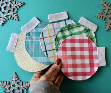
Festive Fabric Coasters Shaped Like Christmas Ornaments
Let's Celebrate
By
Beth Huntington
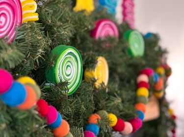
A Candy Land-Inspired Garland to Sweeten Your Space
Let's Celebrate
By
Beth Huntington
A Taylor Swift Gingerbread House Inspired by the "Folklore" Cabin
Chow Down
By
Sophie Boudreau
14 Holiday Trends, From Pink Trees to Retro Vibes
Let's Celebrate
By
Sophie Boudreau
In Our Festive Era! How to Have a Very Merry Swiftmas
Let's Celebrate
By
Damarys Ocaña Perez
What to Bring to Holiday Parties & More Etiquette Tips
Let's Celebrate
By
Kathryn Walsh
Seasonal Clothing Care Tips, From Salt Stains to Sweater Pilling
Home Sweet Home
By
Bianca Fernandez
A Mini Holiday Village Made With Graham Crackers
Chow Down
By
Kirsten Nunez
Art Deco Tree Toppers for a Very Vintage Christmas
Let's Celebrate
By
Sophie Boudreau
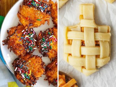
11 Hanukkah Dessert Ideas, From Olive Oil Cookies to Sweet Latkes
Chow Down
By
Kathryn Walsh
10 Homemade Holiday Card Ideas
Let's Celebrate
By
Kirsten Nunez
Felt Food Ornaments With a New York City Theme
Let's Celebrate
By
Sophie Boudreau
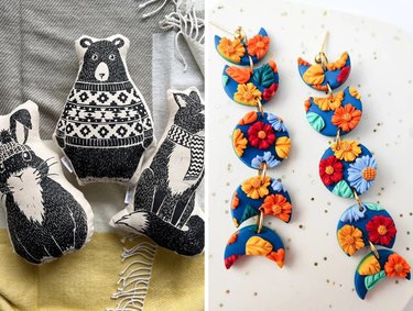
15 Budget-Friendly Homemade Gifts from Etsy
Let's Celebrate
By
Kalia Silva-Phillips
Beyoncé-Inspired Boots With Shimmery Silver Fringe
Get Crafty
By
Kirsten Nunez
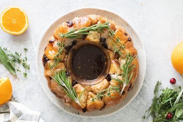
Edible Centerpiece Made of Cranberry-Orange Monkey Bread
Chow Down
By
Anna Buckley
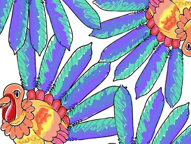
Printable Thanksgiving Activity Pages for the Whole Family
Let's Celebrate
Instagram
Report an Issue
Contact*:
Severity*:
High
Normal
Low
Description*:
Screenshot loading...
Cancel
Submit