Home Sweet Home
Hacks, Tips & Tricks
Squeaky Clean
DIY Decor
Carpentry & Remodeling
Maintenance & Repair
Green Thumb
All Home Sweet Home
Chow Down
Main Dishes
Sweet Treats
Snacks
Copycat Recipes
Drinks & Cocktails
Sides & Appetizers
Veggie Faves
Food Hacks
All Chow Down
Get Crafty
Sew Simple
Fun Crafts
Art Projects
All Get Crafty
Let’s Celebrate
Valentine's Day
St. Patrick's Day
Easter
Mother's Day
Father's Day
4th of July
Back to School
Halloween
Thanksgiving
Christmas
New Year
Weddings
Baby Showers
Birthdays
Parties & Events
Gifts
All Let’s Celebrate
JOIN OUR NEWSLETTER
JOIN OUR NEWSLETTER
Home
Get Crafty
Art Projects
Art Projects
By
Damarys Ocaña Perez
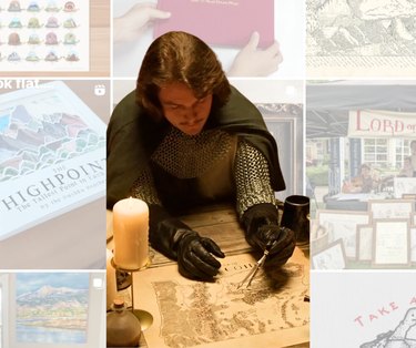
Meet Isaac Dushku — Lord of Maps
Get Crafty
By
Damarys Ocaña Perez
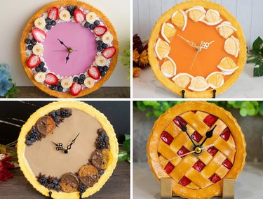
The Wonderful World of Fake Food With Artist Maho Martin
Get Crafty
By
Damarys Ocaña Perez
Piñata Designer Yesenia Prieto on the Joy of Piñata-Making
Get Crafty
By
Aleesha Nash
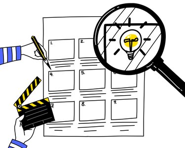
Animation 101 for True Beginners, From Storyboard to Screen
Get Crafty
By
Sophie Boudreau
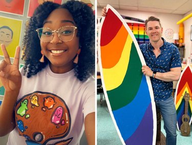
9 Innovative & Inspiring Art Teachers to Follow on Social Media
Get Crafty
By
Beth Huntington
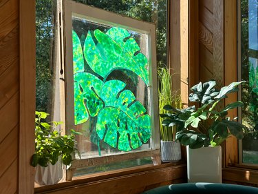
Make Magical Stained Glass Art With Glue (Yes, Glue!)
Get Crafty
By
Aleesha Nash
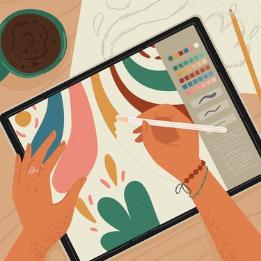
Our Favorite Digital Illustration Apps for Beginners
Get Crafty
By
Aleesha Nash
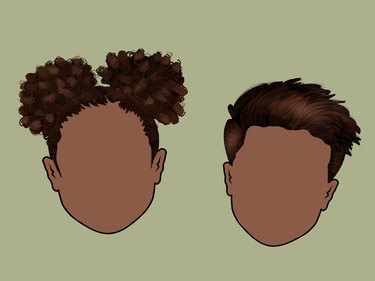
A Beginner-Friendly Guide to Drawing Hair for Digital Illustrations
Get Crafty
By
Jessie Quinn
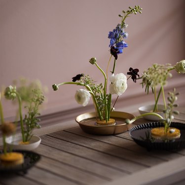
Must-Have Floral Arranging Supplies for Beautiful Bouquets
Get Crafty
By
Beth Huntington
Transform a Thrifted Punch Bowl Into a Mid Mod Masterpiece
Get Crafty
By
Jessie Quinn
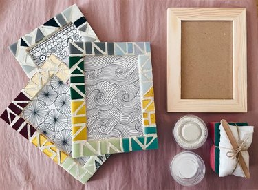
Explore an Ancient Art Form With These Mosaic Kits for Adults
Get Crafty
By
Wanda Martucci
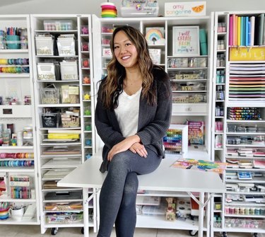
Meet Our Maker of the Month: Amy Tangerine
Get Crafty
By
Jill Layton
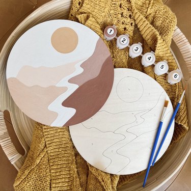
Unleash Your Inner Artist With These Paint by Numbers Kits for Adults
Get Crafty
By
Hilary Ribons
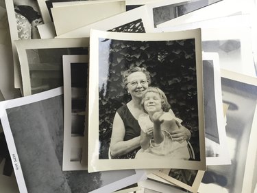
How to Digitize Your Old Photos and Videos, According to Experts
Get Crafty
By
Sophie Boudreau
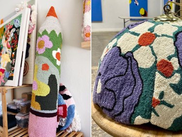
10 Colorful Tufted Creations That Prove Tufting Is Worth the Hype
Get Crafty
By
Jessie Quinn
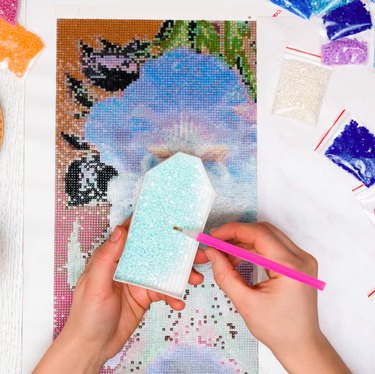
Build Your Own Masterpiece With a Diamond Painting Kit
Get Crafty
By
Sophie Boudreau
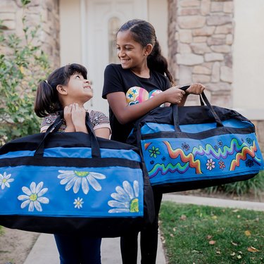
Crafts That Give Back: Foster Love
Get Crafty
By
Adrienne Farr
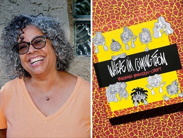
Creator Spotlight: Cartoonist Barbara Brandon-Croft
Get Crafty
By
Spencer Hall
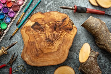
These Wood Burning Pyrography Kits Aren't Your Everyday Art Projects
Get Crafty
By
Sara Kaye Larson
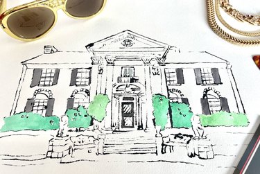
Pay Homage to Your Favorite House With Blotted Line Art
Get Crafty
By
Jill Layton
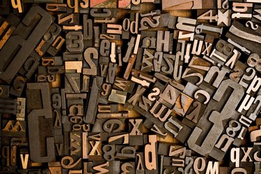
11 Exceptional Etsy Shops for Custom Letterpress
Get Crafty
By
Jessie Quinn
DIY Dollhouse Kits for the Young and Young at Heart
Get Crafty
By
Spencer Hall
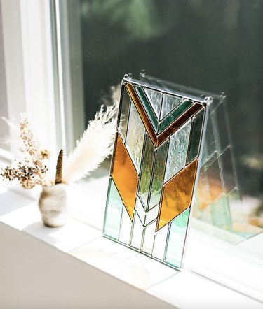
DIY Stained Glass Kits Are the Perfect Hobby to Brighten Up Your Space
Get Crafty
By
Rachel Syens
Crafting as Self-Care: A Creative Journey Through Grief and Anxiety
Get Crafty
By
Beth Huntington
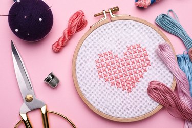
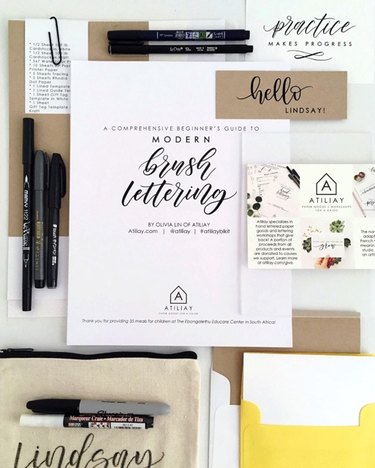
These Calligraphy Kits Might Inspire an Elegant New Hobby
Get Crafty
By
Sophie Boudreau
Creator Spotlight: Fidget-Friendly Jewelry with Nicole Hayden
Get Crafty
By
Ayanna Massey
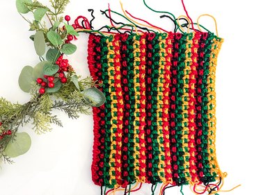
Celebrate Kwanzaa With a DIY Crochet Mkeka
Get Crafty
By
Jonathan Fong
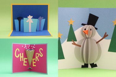
Holiday Pop-Up Cards That Are Easy (Really!) to Make
Get Crafty
By
Philip Schmidt
The Best 3D Printers for Crafting in 2024
Get Crafty
By
Anna Buckley
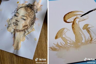
Get Your Creativity Brewing With TikTok Coffee Art
Get Crafty
By
Wanda Martucci
Creator Spotlight: Whimsical Illustrator Rob Sayegh Jr.
Get Crafty
By
Jessie Quinn
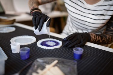
Beginner-Friendly Resin Craft Kits
Get Crafty
By
Rebecca Rakowitz
Teachers Pick the Best Art Supplies for Kids
Get Crafty
By
Jonathan Fong
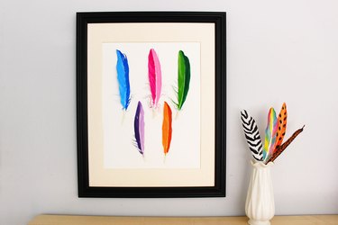
An Easy Feather Craft to Dress Up Walls
Get Crafty
By
Anna Buckley
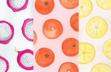
Whimsical Watercolor Fruits to Pep Up Any Space
Get Crafty
By
Beth Huntington
The Best Adult Coloring Books in 2022
Get Crafty
1
2
3
4
5
>
Report an Issue
Contact*:
Severity*:
High
Normal
Low
Description*:
Screenshot loading...
Cancel
Submit