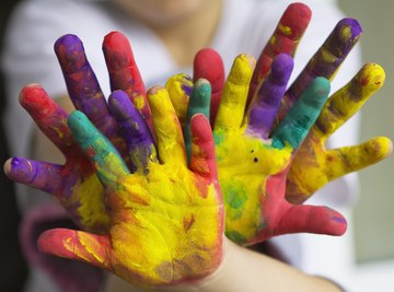

Children take in the world around them through their eyes, and bright colors are one of the first aspects of sight that help them distinguish form and categorize objects. These colors appeal to young children, as they are easier for them to see. At about 5-months old, children can see colors with their still-developing vision, though distinguishing bright colors comes easier to them. As children age, they continue to be drawn to brighter colors. Color has also been known to affect their moods and behavior.
TL;DR (Too Long; Didn't Read)
Bright colors catch young children's eyes because they help kids to distinguish objects from one another in their field of vision. Children spend more time looking at bright colors as opposed to looking at muted shades or pastels.
Colors That Appeal to Children

Children tend to be attracted to the bright block colors of the color wheel rather than pastels or muted blends. Primary colors red, yellow and blue, and secondary colors green, orange and purple, are more appealing than light shades of pink and beige or neutral shades of gray and brown. For this reason, the food and beverage industries, as well as the toy industry, use bright colors to market children's products.
The Bright Color Appeal

Children prefer brighter colors from an early age because their eyes are not fully developed yet. They perceive these colors better than fainter shades. Bright colors and contrasting colors stand out more in their field of vision. As children constantly strive to make sense of their environments, objects that are stark and bright are more stimulating and interesting. One of the first ways they learn to sort things by is color, Colors are some of the earlier words they tend to learn, which is why the easily named, more basic colors appeal to children.
Color and Mood

Doctors understand that color affects emotions, and can have a significant effect on developing children. Warmer colors like orange and yellow bring happiness and comfort. Red has been known to increase the heart rate and therefore increase alertness and the appetite, while cooler colors like blue and green tend to have a calming effect. Teachers and parents may consider the ways in which color affects children's moods when they design their classrooms or bedrooms.
Color and Associations

Children learn from a young age to associate colors with particular objects. For instance, they often associate red with apples, orange with oranges, yellow with bananas or the sun, green with grass, blue with sky or water and purple with grapes. Bright colors are also known to have deeper associations. For instance, red is often connected with passion, green with nature and blue with sadness.
References
- The New York Times: Color Has a Powerful Effect on Behavior, Researchers Assert
- BBC: Babies Have Favourite Colours
- Kaplan Early Learning Company; Using Color to Enhance Learning and Influence Mood
- American Optometric Association: Infant Vision: Birth to 24 Months
- Harrington College of Design: Colors and Moods: The Psychological Impact of Paint Colors
About the Author
Rachel Pancare taught elementary school for seven years before moving into the K-12 publishing industry. Pancare holds a Master of Science in childhood education from Bank Street College and a Bachelor of Arts in English from Skidmore College.