
A histogram is a tool used to graphically present information. Commonly, histograms are presented as bar charts used to show relationships between data; they are used for many types of information. From a histogram you can easily extrapolate the mean, minimum, maximum and other statistical information often used to analyze data in order to understand the subject or make improvements of some kind.
Information
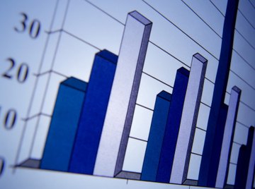
A histogram is most commonly a bar chart (or bar graph) that contains bars of equal width to illustrate a set of information. There are two types of information represented on a histogram: "classes" (or "bins") are the groups of data placed on the chart represented by the bars; the other type of information is the "count," represented by the size of the bars. A histogram visually illustrates the count of the various bins. A histogram should always be clearly labeled with the title of the chart as well as what the bins and count represent.
Histograph
A histograph is a tool completed within a histogram that graphs the midpoints of the bars to represent the changes in the graph. While the histogram uses boxes to represent quantities of each bin, a histograph shows changes in the information in the form of a line graph; that is, the points and lines on a histograph visually represent the variance in the histogram.
Weaknesses
Histograms characteristically have two main weaknesses. First, they are easy to manipulate in order to demonstrate or support a desired conclusion; this is accomplished by using more or fewer bars to reflect the information. The other weakness is that time differences are often not taken into consideration in the representation of the data; this is important when, for example, analyzing consecutive production runs or overlaps of runs in manufacturing. These two weaknesses can be misleading to those analyzing the information.
Details
A histogram is designed to provide quick apprehension of many kinds of information, including the mean, minimum and maximum values of the information plotted on the chart. Other calculations made from the histograms include finding the standard deviation in the data as well as the class width, which represents the range from the left to the right on the chart.
References
About the Author
Jennifer VanBaren started her professional online writing career in 2010. She taught college-level accounting, math and business classes for five years. Her writing highlights include publishing articles about music, business, gardening and home organization. She holds a Bachelor of Science in accounting and finance from St. Joseph's College in Rensselaer, Ind.
Photo Credits
Ryan McVay/Photodisc/Getty Images