Skew is an important feature of a histogram chart -- a special kind of bar graph widely used for statistical number crunching. Skew shows up as an asymmetry or unbalanced shape of the graph, indicating that certain sub-groups of data occur more often than others. Microsoft's Excel has a convenient histogram function that analyzes raw data and automatically creates a chart for you.
Step 1
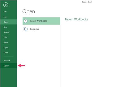
Open a blank Excel document. Click the File menu and then click Options.
Video of the Day
Step 2
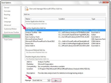
Click Add-ins to see a list of optional features. In the list, click Analysis ToolPak to select it. Click Excel Add-ins next to Manage and then click the Go button.
Step 3
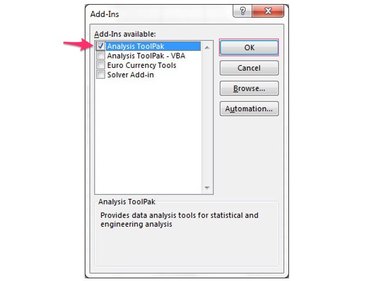
Ensure that Analysis ToolPak is checked. Click the check box if Analysis ToolPak is not selected. Click the OK button.
Step 4
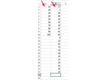
Create two columns of data in the worksheet. One column has the bins or groups into which the data falls and the other is the raw data of the parameter you're measuring. For example, to break data evenly into the groups, 1 through 10, 11 through 20, and so on through 91 through 100, you create the bins 10, 20, 30 and so on through 100. In another column, type the raw sample data, which may be the people who participated in a study sorted by age, for example.
Step 5
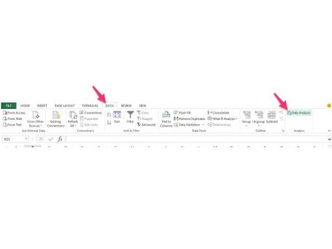
Click the Data menu and then click Data Analysis to see a list of Excel data analysis functions.
Step 6
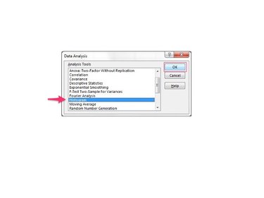
Select Histogram by clicking it in the list and then click the OK button to bring up the histogram dialog box.
Step 7
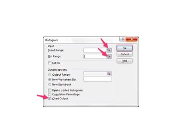
Click the small spreadsheet grid icon next to Input Range. In the worksheet, select the data as a range by clicking the first cell of the data column, dragging straight down to the last occupied cell, and releasing the mouse button. Click the grid icon next to Bin Range and select the bin column cells in the same manner. You can also click in the text areas for Input Range and Bin Range and type the range manually. In the example shown, the bin range is A1:A10 and the data range is B1:B22. Click the check box next to Chart Output. Click the OK button to see the histogram data and chart created in a new worksheet.
Step 8
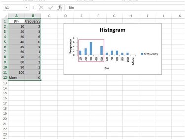
Examine the histogram chart to see if its shape is symmetric or not. Note that, in this example, the data is not evenly distributed but is skewed to the left half of the chart.
Video of the Day