Home Sweet Home
Hacks, Tips & Tricks
Squeaky Clean
DIY Decor
Carpentry & Remodeling
Maintenance & Repair
Green Thumb
All Home Sweet Home
Chow Down
Main Dishes
Sweet Treats
Snacks
Copycat Recipes
Drinks & Cocktails
Sides & Appetizers
Veggie Faves
Food Hacks
All Chow Down
Get Crafty
Sew Simple
Fun Crafts
Art Projects
All Get Crafty
Let’s Celebrate
Valentine's Day
St. Patrick's Day
Easter
Mother's Day
Father's Day
4th of July
Back to School
Halloween
Thanksgiving
Christmas
New Year
Weddings
Baby Showers
Birthdays
Parties & Events
Gifts
All Let’s Celebrate
JOIN OUR NEWSLETTER
JOIN OUR NEWSLETTER
Home
Home Sweet Home
Hacks Tips and Tricks
Hacks Tips and Tricks
By
Sophie Boudreau
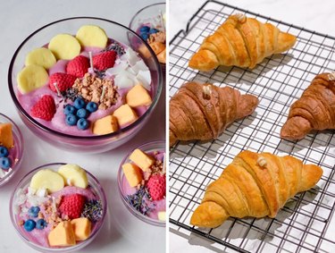
Candles That Look Like Food, From Croissants to Iced Coffee
Home Sweet Home
By
Sophie Boudreau
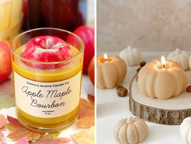
Fall Candles Galore! Our Favorite Seasonal Scents
Home Sweet Home
By
Kathryn Walsh
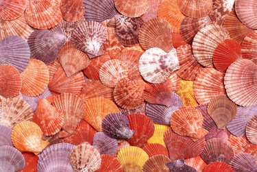
Mermaidcore Ideas That'll Make a Splash
Home Sweet Home
By
Kathryn Walsh
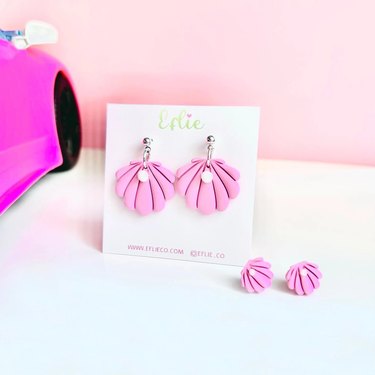
Barbie Earrings...Just Like the Ones in the Movie!
Home Sweet Home
By
Kathryn Walsh
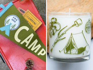
Calling All "The Parent Trap" Fans: Summer Camp Vibes Are Here!
Home Sweet Home
By
Sophie Boudreau
Easy DIY Tips For a Bug-Free Summer
Home Sweet Home
By
Megan McCarty
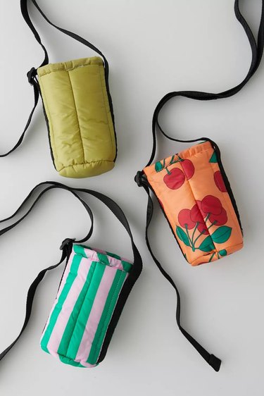
Stay Hydrated (and Stylish) With These Water Bottle Holders
Home Sweet Home
By
Megan McCarty
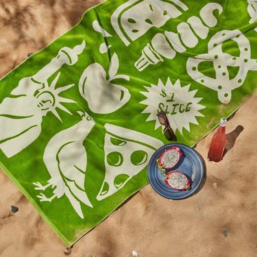
11 Beach Towels That Are Anything But Boring
Home Sweet Home
By
Fred Decker
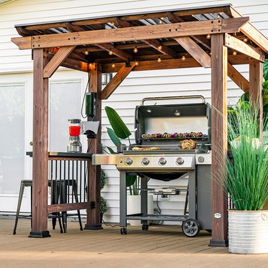
Protect Your Grill From the Elements With These Gazebos
Home Sweet Home
By
Kathryn Walsh
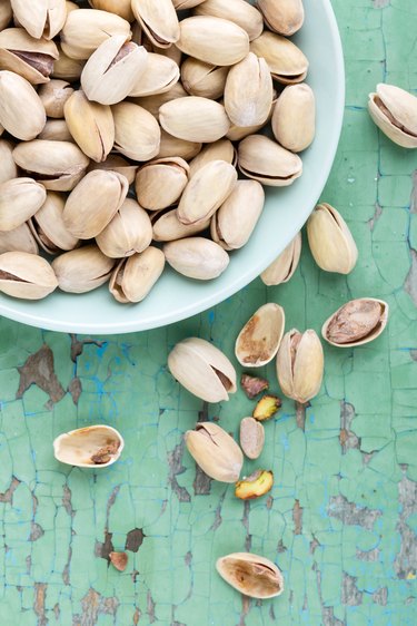
Trend Report: All Things Pistachio
Home Sweet Home
By
Megan McCarty
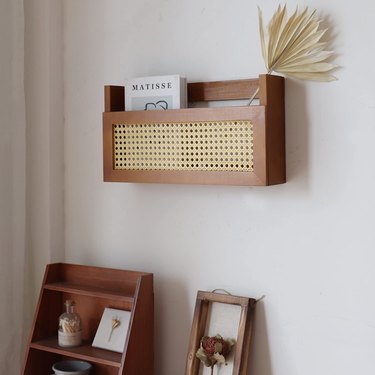
11 Magazine Holders to Solve Your Storage Issues
Home Sweet Home
By
Megan McCarty
Amazon Travel Must-Haves To Take On Your Next Vacation
Home Sweet Home
By
Jill Layton
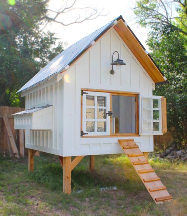
These Backyard Chicken Coops Are at the Top of the Pecking Order
Home Sweet Home
By
Jill Layton
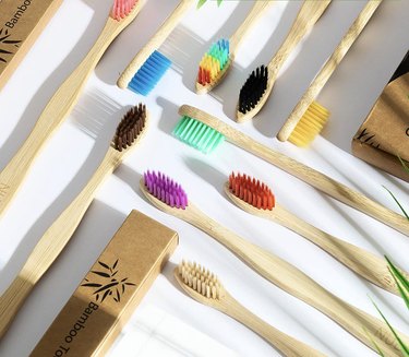
Sustainable Bathroom Swaps for More Eco-Friendly Living
Home Sweet Home
By
Kathryn Walsh
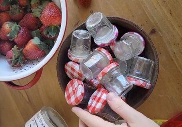
8 Fun Ways to Reuse Mini Bonne Maman Jars
Home Sweet Home
By
Jill Layton
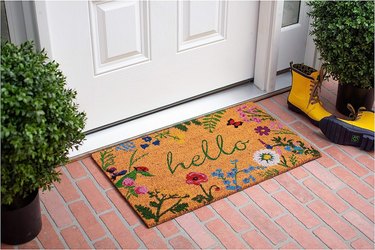
Freshen Up Your Front Porch With These Spring Decor Pieces
Home Sweet Home
By
Kathryn Walsh
Trend Report: "Granfluencers"
Home Sweet Home
By
Jessie Quinn
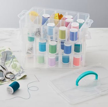
Embrace the 'Cluttercore' Trend With These Craft Organizers
Home Sweet Home
By
Kathryn Walsh
Trend Report: 1970s Detective (Calling All Columbo Fans!)
Home Sweet Home
By
Sophie Boudreau
Trend Report: Dark Academia
Home Sweet Home
By
Anna Buckley
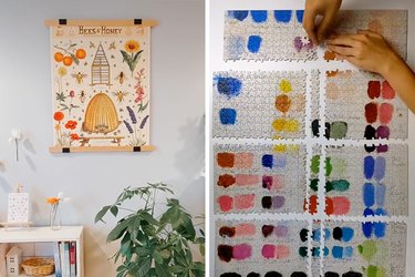
The Most Impressive Puzzle Hacks of TikTok
Home Sweet Home
By
Spencer Hall
Premium-Looking Kitchen Countertop Storage That Doesn't Cost a Fortune
Home Sweet Home
By
Jill Layton
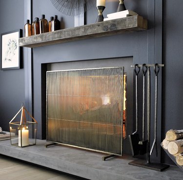
Fireplace Screens That Deliver Safety and Style
Home Sweet Home
By
Megan McCarty
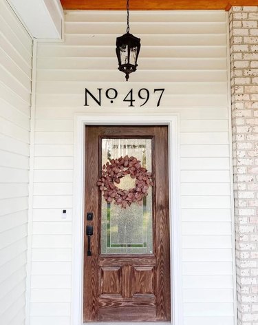
Custom House Numbers That Will Enhance Your Home's Curb Appeal
Home Sweet Home
By
Sophie Boudreau
Wallpaper Inspired by Your Favorite TV Characters
Home Sweet Home
By
Spencer Hall
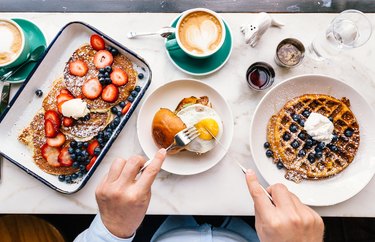
14 Kitchen Products to Help You Make the Perfect Brunch
Home Sweet Home
By
Kathryn Walsh
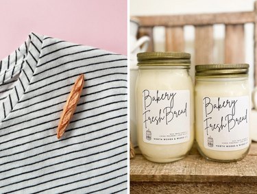
Bon Appétit! Our Favorite French Bread-Inspired Items
Home Sweet Home
By
Kelsey Pudloski
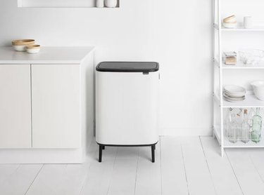
This Modern Trash Can Solved My Kitchen Clutter Issues
Home Sweet Home
By
Kathryn Walsh
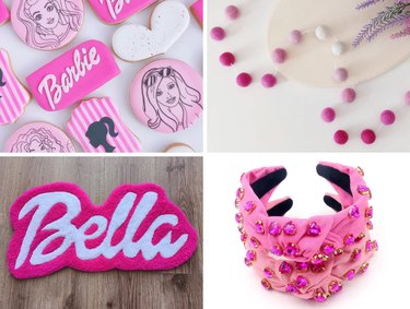
Trend Report: Barbiecore (Think Pink!)
Home Sweet Home
By
Fred Decker
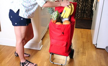
Rolling Grocery Carts Aren’t Just for Grandmas—Here Are the Best Ones
Home Sweet Home
By
Jill Layton
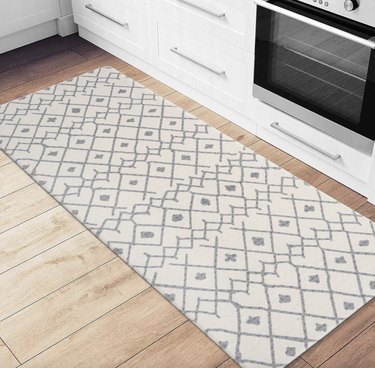
Make Meal Prep More Enjoyable With These Kitchen Comfort Mats
Home Sweet Home
By
Jill Layton
11 Products That Will Keep Your Car Neat and Organized
Home Sweet Home
By
Jill Layton
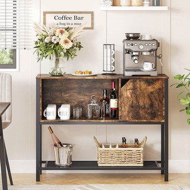
Coffee Bar Cabinets That Combine Function and Style
Home Sweet Home
By
Spencer Hall
Ring in a New Year of Savings With Wayfair's Fresh-Start Sale
Home Sweet Home
By
Kathryn Walsh
Trend Report: Maximalism (More is More!)
Home Sweet Home
By
Jill Layton
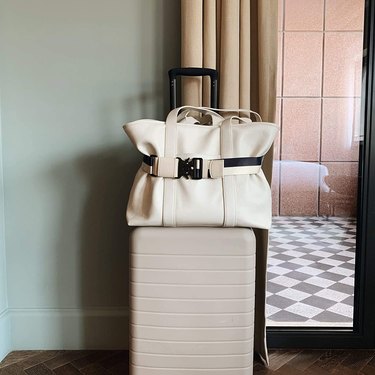
For Short Trips, You Can't Go Wrong With a Weekender Bag
Home Sweet Home
1
2
3
4
>
Report an Issue
Contact*:
Severity*:
High
Normal
Low
Description*:
Screenshot loading...
Cancel
Submit