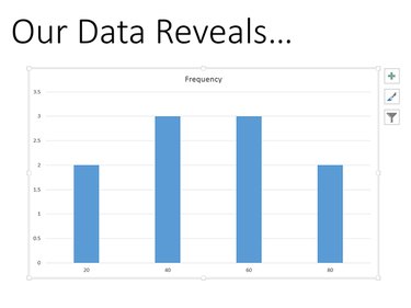
Using the chart options available in PowerPoint, you can turn your data into a histogram. You will need the appropriate data, normally presented as Bin and Frequency. For example, to display a histogram of student grades, the grades would be the Bin data and the number of students with each grade would be the Frequency. You can also paste an Excel-created histogram directly into PowerPoint and then customize the chart.
Creating a Histogram in PowerPoint
Video of the Day
Step 1
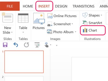
Select the PowerPoint slide where you want to insert the histogram. Make sure the data you need for the histogram is nearby, then click the Insert tab and select the Chart icon.
Video of the Day
Step 2
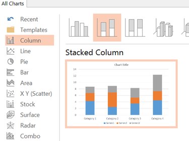
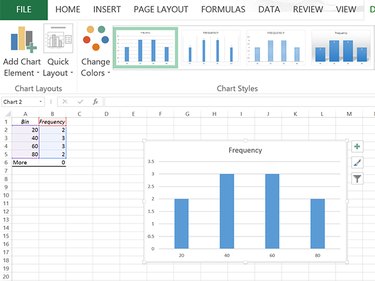
Click the Columns option in the Charts window and select the Stacked Column chart, which is the second icon. This is the easiest chart to customize for a histogram. When the chart opens, an Excel-like worksheet appears above the chart.
Step 3
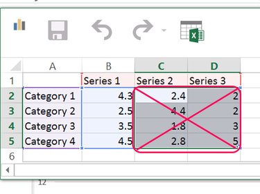
Drag the cursor across the cells containing the data for Series 2 and Series 3 and press Delete to remove data from the columns.
Step 4
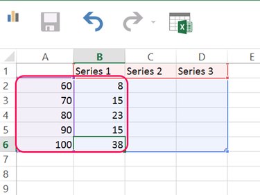
Replace the data in Column A, beginning with cell A2 with the Bin data for your histogram. Replace the data beneath Series 1, beginning with cell B2, with your Frequency data. The chart now looks exactly like a histogram produced by Excel's Histogram data analysis.
Step 5
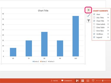
Customize the chart as desired by clicking the icons in the upper-right corner. For example, to remove the Chart Legend below the chart, click the + icon and then clear the Legend check box. You can change the Chart Title by clicking it and typing a new title, or clear the Chart Title check in the + icon's drop-down menu.
Importing a Histogram From Excel
Step 1
If you don't already have the histogram data, follow the eHow tutorial to create a histogram in Excel. When you're done, you will have a histogram chart. Right-click the chart in Excel and select Copy from the drop-down menu.
Step 2
Open PowerPoint and select a slide. Press Ctrl-V to paste the chart in the slide. After it has been inserted, you can edit the chart as you would any chart you created in PowerPoint from scratch.