


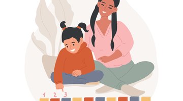
What is One-to-One Correspondence?
One-to-one correspondence is a basic math skill in which children pair one object or name with a number. As a benchmark standard for learning during the kindergarten year, young children can develop this type of pairing knowledge through hands-on math activities that encourage matching quantities and can improve fine motor skills with math concepts. These one-to-one correspondence activities can include counting activities, counting games, counting skills, math games, number cards, manipulatives, printable images or symbols, board games and worksheets. These activities can also be incorporated by preschool teachers or kindergarten teachers to teach number words and other learning activities. As addition and subtraction are essential learning fundamentals for children, these activities could also help in their skillset as students use their memory to connect numbers with objects.
To teach one-to-one activities to students, patience and understanding is needed. Doing these activities in small groups could also be helpful for the students. While Kindergarteners are normally aged 4 to 6 years-old, they are still in early childhood and could be still developing skills from pre-K. Each one will be different in terms of development and skill set, as a 4 year-old will be different from a 6 year-old as early math can take a while to learn properly. These skills can be incorporated in homeschool, math centers, kindergarten math class activities and lesson plans for learners.
Examples of One-to-One Correspondence Activities for Kindergarteners:
1. Memory Cards

A memory match activity can teach kindergarten students one-to-one correspondence while also building recall and recognition skills by counting objects. You can use a ready-made deck of memory cards, or get crafty with your kindergartner and create your own. Write the numbers one through 10 on index cards, with one numeral on each card.
Make another deck of cards that corresponds to those numbers. Have the child draw shapes or use stickers. For example, draw one star on one card, two on the next, three on the next, and so on for each card and number of objects needed. Flip the cards over and spread them out on a desk. Have the child flip over two cards. Ask if the number matches the amount in the picture of the other card. If not, flip them back over and repeat the process. The child needs to remember where they put each card to match them with the correct number.
2. Money Match

A money match game teaches kindergarten students to pair like quantities and helps them to build financial literacy. Start with one pile of pennies, nickels, dimes and quarters. Use up to 10 of each. Separate one of each coin out, and line them up. Ask the students to put the other coins in a line behind the one that they match with. For example, the student will put the other nine dimes in a vertical line following the first one that you have set out.
You can add to this activity by using numeral cards. Write the numbers one through 10 on index cards. Place the cards face up. Have the students match the number of coins with the number on the card. This means that the students would put one penny on the number one card and so on.
3. Roll the Dice

Kindergartners can match the numbers that they count with groups of objects in the same quantity. Start with one die. Before the students roll it, gather together a basket of small plastic toy animals, buttons, beads or other similarly sized objects. Ask one child to roll the die. Have them count the dots and tell you the quantity. Next, ask them to count out the same number of items from the basket.
They will place these next to the number they rolled. Snap a picture of the pairing. Print it out and have the child write the numeral for the quantity on the photo or on a card that you place below. Repeat for other numbers, making a photo display for the kindergartners to use during a post-activity reflection. Discuss the activity and have the students point out the matching numbers.
4. Sort and Match Colors

Combine color and number recognition skills into a one-to-one correspondence activity for kindergartners. Give the students a bin or basket filled with different colors of items. You can choose which type of object you want to use. Examples include buttons, beads, crayons or candies. Cut out index card-sized pieces of colored construction paper. Start with one color per one piece of paper. Have the students match the one object to its like-colored piece of paper.
Next, have the students group up to 10 items of the same color on the matching piece of paper. Ask the students to count each quantity and write the number onto the paper. You can add a graphing activity by supplying the students with different quantities of colored objects. For example, four green crayons, three red ones, five blue ones and seven purple ones. After the students sort and match the crayons. Chart how many of each the students counted using a bar graph that has the colors written on the bottom and the numbers on the side.
5. Egg Carton Counting
Another one-to-one correspondence activity could be egg carton counting. For this activity, you will need an egg carton and some objects, like marbles or little bears. You will write numbers or math problems in each egg compartment. The students will then either solve the math problem to determine the number of objects they need, or they can look at the number assigned to that egg container. The students will then use that number to collect objects and place the correct amount of objects used in that egg container in the carton.
Related Articles


References
Writer Bio
Based in Pittsburgh, Erica Loop has been writing education, child development and parenting articles since 2009. Her articles have appeared in "Pittsburgh Parent Magazine" and the website PBS Parents. She has a Master of Science in applied developmental psychology from the University of Pittsburgh's School of Education.