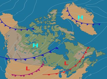
Prevailing winds like the trade winds are currents of air which move across the surface of the earth in a generally westward direction. In a more detailed weather report, wind direction and speed are shown using a symbol called a wind barb. Newer digital wind maps present wind speeds using color and wind direction using arrowheads. So while the classic wind barb symbol is useful, if you're checking on today's forecast or the projected wind tomorrow, always check the map key for each wind map to learn which convention is being followed.
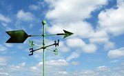
Wind direction and wind speed are important for navigation in shipping and air traffic, as well as for eco-businesses which harvest that energy.
Realize that the trade winds and the polar easterlies are prevailing winds that blow from east to west thanks to the rotation of the earth around its own axis. At the equator, the widest part of the earth's sphere, there is an area of calm where typically no wind blows. This area is called the doldrums. Between about 30 and 60 degrees north and south, the prevailing winds are westerlies. This means that they blow from west to east.
Learn the way to speak about wind directions. When a wind is easterly, it blows from the east towards the west. However, when the wind is eastward, it blows from the west towards the east. The suffix is what determines the direction: "ly" means from and "ward" means towards. Now you will be able to designate the local wind directions that you find on the wind map.
Look on your map for a wind barb that looks like a plain circle. Remember that a circle encompasses 360 degrees. Each fourth of the circle is an area of 90 degrees. The amount of the circle which is filled in shows the direction from which the wind blows: northerlies are shown by a filled in circle; easterlies are shown by a circle missing one fourth or 90 degrees; a half circle filled in shows southerlies: and a circle which is three-fourths filled in indicates that the wind is from the west.
Find a wind barb that has a circle and a line extending out from the circle. This shows both the wind's direction and its speed. The line will be topped by other lines. A short line means that the wind is blowing at a speed of five knots (a knot is equal to 1.5 miles per hour). A long line means that the wind is blowing at ten knots. Multiply each longer line by ten and add five for a shorter line to obtain the wind speed. If you find a wind barb that ends in a triangular flag-shaped pennant, add 20 knots to the wind speed for each pennant.
Tips
Resources
About the Author
Lesley Barker, director of the Bolduc House Museum, authored the books "St. Louis Gateway Rail—The 1970s," published by Arcadia, and the "Eye Can Too! Read" series of vision-related e-books. Her articles have appeared in print and online since the 1980s. Barker holds a Bachelor of Arts in sociology from Washington University and a Master of Arts in Teaching from Webster University.