Home Sweet Home
Hacks, Tips & Tricks
Squeaky Clean
DIY Decor
Carpentry & Remodeling
Maintenance & Repair
Green Thumb
All Home Sweet Home
Chow Down
Main Dishes
Sweet Treats
Snacks
Copycat Recipes
Drinks & Cocktails
Sides & Appetizers
Veggie Faves
Food Hacks
All Chow Down
Get Crafty
Sew Simple
Fun Crafts
Art Projects
All Get Crafty
Let’s Celebrate
Valentine's Day
St. Patrick's Day
Easter
Mother's Day
Father's Day
4th of July
Back to School
Halloween
Thanksgiving
Christmas
New Year
Weddings
Baby Showers
Birthdays
Parties & Events
Gifts
All Let’s Celebrate
JOIN OUR NEWSLETTER
JOIN OUR NEWSLETTER
Home
Home Sweet Home
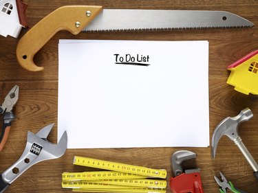
Home Maintenance & Repairs
Home Maintenance & Repairs
By
Kathryn Walsh
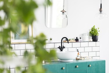
10 Easy & Budget-Friendly Bathroom Makeover DIYs
Home Sweet Home
By
Kathryn Walsh
Transform Your Kitchen With These 10 Easy DIY Upgrades
Home Sweet Home
By
Ashley Tyler
10 Simple Hacks for Easy Snow & Ice Removal
Home Sweet Home
By
Kathryn Walsh
10 Common Causes of Mold in Your Home (& Tips for Prevention!)
Home Sweet Home
By
Ashley Tyler
10 Common Summer Pests & How to Prevent Them
Home Sweet Home
By
Kathryn Walsh
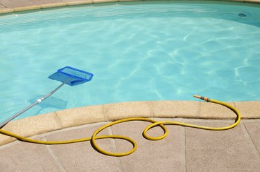
10 Tips & Tricks to Keep Your Pool Area Safe
Home Sweet Home
By
Kathryn Walsh
10 Money-Saving Pool Maintenance Tips & Tricks
Home Sweet Home
By
Fred Decker
10 Brilliant Home Maintenance Hacks to Change Your Life
Home Sweet Home
By
Kathryn Walsh
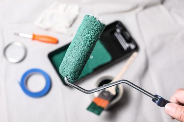
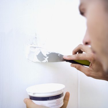
10 Game-Changing Home Painting Hacks
Home Sweet Home
By
Lauren McQuade
Take It Inside: How to Keep Your House Cool This Summer
Home Sweet Home
By
Debbie Williams
How to Secure a Dresser to the Wall for Childproofing
Home Sweet Home
By
Chris Deziel
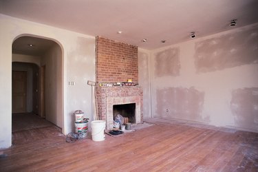
How To Remove Lead Paint
Home Sweet Home
By
eHow Team
DIY Mini Desktop Air Conditioner to Keep You Cool
Home Sweet Home
By
Eve Epstein
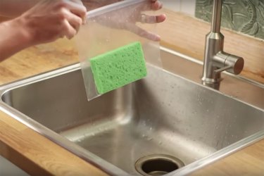
Make an Ice Pack Out of a Kitchen Sponge Easily
Home Sweet Home
By
Carrie Waller
How to Seal a Granite Countertop
Home Sweet Home
By
Jessica Begum
DIY Holiday Reindeer Mugs
Home Sweet Home
By
Jessica Kielman
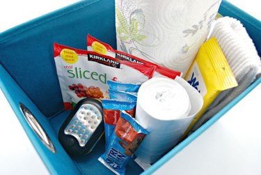
Smart Tips on How to Organize the Family Car
Home Sweet Home
By
Debbie Williams
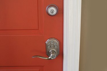
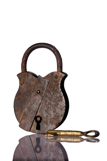
How to Easily Install a Deadbolt Lock onto a Door
Home Sweet Home
By
Debbie Williams
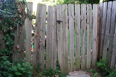
How to Repair a Sagging Gate
Home Sweet Home
By
Debbie Williams
How to Patch a Hole in the Roof
Home Sweet Home
By
Debbie Williams
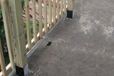
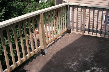
How to Replace a Rotted Wood Porch Railing
Home Sweet Home
By
Debbie Williams
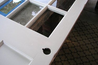
How to Replace a Pane of Glass in a Door
Home Sweet Home
By
Debbie Williams
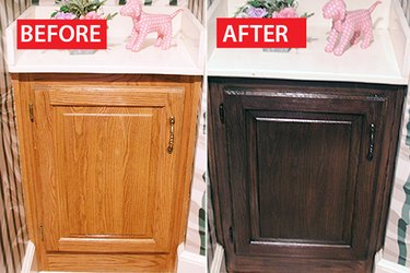
Before & After: A Honey Oak Cabinet Refinished
Home Sweet Home
By
Cameron Oden
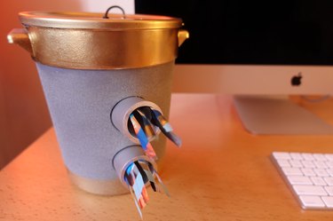
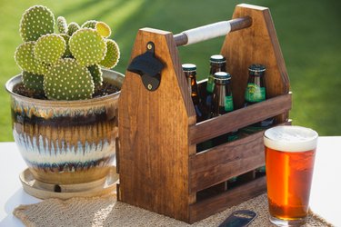
How to Craft Your Own Wood Beer Caddy
Home Sweet Home
By
Charity Tober
How to Care for an Intex 16-Foot Above-Ground Pool
Home Sweet Home
By
Wade Shaddy
How to Seal a Window Screen Gap
Home Sweet Home
By
Wade Shaddy
How to Shorten Wooden Blinds That Have a Pulley
Home Sweet Home
By
Elizabeth Sobiski
How to Remove a Tecumseh Snowblower Choke Knob
Home Sweet Home
By
Melissa Rae
How to Fill & Drain a Cal Spa Hot Tub
Home Sweet Home
By
S.R. Becker
How to Remove Dried Spackling Off Walls
Home Sweet Home
By
Mike Matthews
The Difference Between Sanding Sealer & Pre-Stain
Home Sweet Home
By
Nikki Fotheringham
How to Use Drywall Mud as a Substitute for Wood Filler
Home Sweet Home
By
Russell Bowen
Electrogalvanized Vs. Hot Dipped Galvanized
Home Sweet Home
By
Wade Shaddy
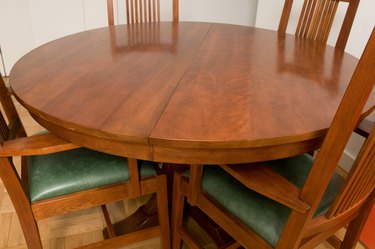
How to Attach Pedestal Legs to a Dining Table
Home Sweet Home
By
Chris Deziel
How to Remove a Corian 4-Inch Backsplash From Drywall
Home Sweet Home
By
Chris Deziel
How to Tell If a Creaking and Lumpy Floor Is Rotting
Home Sweet Home
1
2
3
4
5
>
Report an Issue
Contact*:
Severity*:
High
Normal
Low
Description*:
Screenshot loading...
Cancel
Submit