
Graphs and charts are visual representations of data in the form of points, lines, bars, and pie charts. Using graphs or charts, you can display values you measure in an experiment, sales data, or how your electrical use changes over time. Types of graphs and charts include line graphs, bar graphs, and circle charts. Different types of graphs and charts display data in different ways, and some are better suited than others for different uses. To interpret a graph or chart, read the title, look at the key, read the labels. Then study the graph to understand what it shows.
- Graph
- Chart
- Pen
- Paper
- Computer
- Calculator
Read the title of the graph or chart. The title tells what information is being displayed. For example, a graph or chart of the quantity of pants sold in June may be titled, "Number of Pants Sold in June."
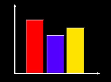
Look at the key, which typically is in a box next to the graph or chart. It will explain symbols and colors used in the graph or chart. In a line graph of the "Number of Pants Sold in June," a blue line might display the number of blue pants sold per day during the month, the red line the number of red pants, and the brown line the number of brown pants. Such a line chart can show not only how sales changed from day to day, but a quick glance shows the popularity of each color. Similarly, in a bar graph, the blue rectangle displays the blue pants sold that month, the red rectangle displays the red pants, and the brown rectangle displays the brown pants.You can put the bars next to each other in a monthly chart that just displays the relative sales of each color, or you can stack the three color bars on each other to display next to similar bars for other months. Then the bars not only show the change in sales over time, but also the change over time in the relative proportion of each color sold. In a circle, or pie chart, the blue portion of the circle is the proportion of total pants sold that were blue, the red is the proportion that were red, and the brown is the proportion that were brown.
Read the labels of the graph or chart. The labels tell you what variables or parameters are being displayed. For example, on a line or bar graph of the "Number of Pants Sold in June," the x-axis might be the days of the month, and the y-axis might be the number of pants sold. For a circle chart, the number of each color of pants sold in the month of June will be displayed as a percentage of the circle. Fifty percent of pants sold may be brown, 40 percent blue sold, and 10 percent red.
Draw conclusions based on the data. You can reach conclusions faster with graphs than you can using a data table or a written description of the data. For example, on the line graph, the brown line rose the highest, the blue line is in the middle, and the red line rose the lowest. On the bar graph, the brown bar is the highest, the blue bar is the next highest, and the red bar is the lowest. Within the circle chart, half of the circle is brown, most of the other half is blue, and a small portion of that half is red. All of these representations indicate that the brown pants sold the best, then the blue pants, and that the red pants did not sell very well.
If you are learning about graphs and charts in math class, answer questions about the graphs and charts in your homework. Have a friend make up questions about the chart or graph. As you answer the questions, your friend can critique you. You can do the same for your friend. You may ask questions such as, "Based on the data, which pants were the least popular?"
Things You'll Need
References
About the Author
Mara Pesacreta has been writing for over seven years. She has been published on various websites and currently attends the Polytechnic Institute of New York University.
Photo Credits
business graph image by Alexey Klementiev from Fotolia.com