
Compiled data or questionnaire results may be visually graphed to succinctly display the information. This method of results viewing is an effective way for your audience to ascertain the information in a short period of time. A graph has the ability to show grouped results from the questionnaire in a way that makes their relationship to one another apparent.
Consider accompanying the conclusion report for a completed questionnaire with a visually compelling graph that conveys the most information in the least amount of time.
Designing the graph
- Foam-core poster board
- Yardstick or T-square (optional)
- Markers
Add representational images--such as symbols or logos--that are instantly recognizable to the graph to get the point across to viewers even faster.
Divide the answers from the questionnaire into categories and assign one point to each response that falls into that category. Keep in mind, you may need to create a "no response" or "other" category for answers that do not fit into the selected categories. Keep a tally of all the answers as the questionnaires are being reviewed.
Title each representational graph at the top of the poster board with the specific question from which its information was derived. The first thing most viewers will look for is the title of the graph.
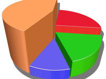
Consider the type of graph that best displays the variety of results you received from the questionnaire. Most questionnaire graphs are pie charts that show percentages of the group answered with various responses. Bar, picture or line graphs are other options. Divide the number of a given response by the total number of those questioned to calculate the response percentages for graphing.
Draw your graph and label it so each section is clearly defined. Line and bar graphs with X and Y axes must be marked with their title and range of scale. Add color to make it easier for viewers to differentiate one part of the graph from another.
You can compare the results from the most recent questionnaire with identical surveys from the past. Use a line graph to show upward and downward trend in the responses. Feel free to skip this step if the questionnaire you are graphing is the first of its kind.
Things You'll Need
Tips
References
Tips
- Add representational images--such as symbols or logos--that are instantly recognizable to the graph to get the point across to viewers even faster.
About the Author
Jeffrey Brian Airman is a writer, musician and food blogger. A 15-year veteran of the restaurant industry, Airman has used his experience to cover food, restaurants, cooking and do-it-yourself projects. Airman also studied nursing at San Diego State University.
Photo Credits
pie graph image by Tomislav from Fotolia.com