So, you've decided that it's time for a new paint job. You can picture your home all spruced up, and you know that it's going to be awesome. But first, there's that pesky business of picking out the perfect paint colors. Trends aside, there are a number of factors to consider when selecting interior paint. And to help you navigate these tricky waters, we have put together a list of guidelines to ensure that you choose the best paint colors for your abode's swanky new facelift.
Decide on a mood for the room.
Video of the Day
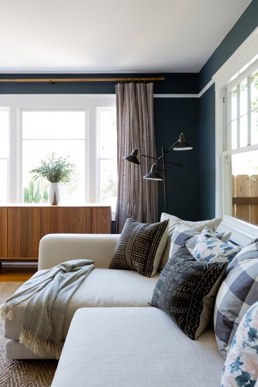
How do you want this room to feel? That is (arguably) the million dollar question when it comes to narrowing down your paint color options. Lighter shades can brighten up a room and create a sense of spaciousness, while darker hues tend to up the drama factor and make a space feel more cozy and intimate. Try to imagine what each color would feel like to you, and to your house guests. Generally speaking, lighter colors tend to work best in kitchens and living rooms, while bedrooms and dining rooms can be better suited by darker colors. However, the choice is entirely subjective and there are no right or wrong answers.
Video of the Day
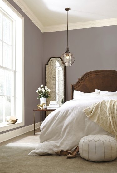
Consider your lighting.
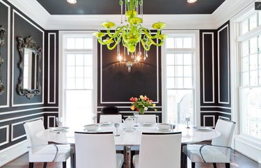
A paint color's appearance can change dramatically based on the lighting. While colors are intensified and appear most vividly under natural light, incandescent lighting brings out warmer undertones (yellows). Fluorescent lighting, on the other hand, brings out cooler (blue) tones. For example, the dining room above can rock black walls without feeling closed in thanks to the natural light that's pouring in from the floor to ceiling windows, but that same light might be overwhelming in a room with brighter colored walls. As a rule of thumb, avoid darker colors in rooms that have limited lighting — but if the room is well lit, go for it!
Find inspiration from decor.
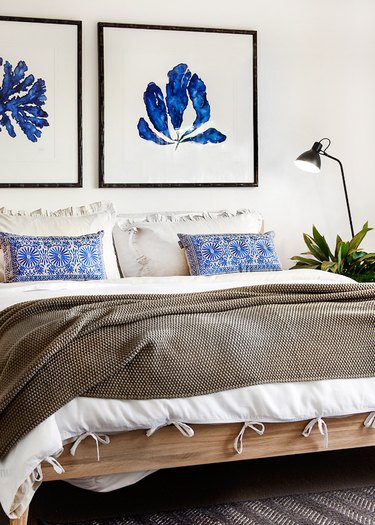
One of the easiest ways to choose paint colors for your home is to get inspired by specific pieces of decor. Printed textiles make a good starting point when using this method to find the perfect hue. Use your favorite accent pillow, bed throw, or piece of art as a touchstone when creating a color palette — but try to limit yourself to a three color paint scheme.
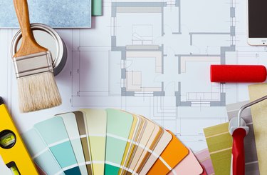
Get help selecting your color palette.
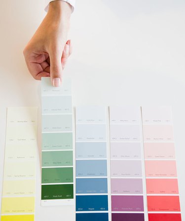
Color wheels and paint swatches are insanely handy when it comes to choosing paint colors for your home, and they're especially helpful when matching interior wall paints from room-to-room. While you're trying to decide on the perfect hue, consider a color palette that combines various shades of a single color for a particularly polished look. These helpful tools will also save you time and stress when you're ready to purchase your paint at the hardware store. Just hand the clerk your paint chip or swatch and they should be able to find, or match, your favorite color in no time.
Take each color for a test run.
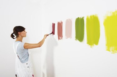
If you're still having trouble narrowing down your paint colors, run down to the hardware store and pick up a few sample cans of paint for the top color contenders. This way you can paint swatches directly onto the wall to get a better idea of what each color will really look like. Sometimes just being able to stand back and see the different colors on a larger scale can help you make the final decision.
Figure out your paint finish preferences.
Interior paint comes in a number of finishes, the most common being flat, matte, eggshell, satin, semi-gloss, gloss, and high-gloss (other finishes are available in specialty paints). Semi-gloss, gloss, and high-gloss finishes are usually reserved for kitchens and bathrooms, while matte, flat, eggshell, and satin finishes cover the majority of interior walls. You can also use different finishes alongside one another to create a visual effect. The major selling point for a gloss finish is that it's incredibly easy to clean; but keep in mind, it's also incredibly shiny.
Let the fun begin!
Now that the hard part is over, it's time to get your hands a little dirty. So strap on those denim overalls, and double check that you have all of the necessary tools for a DIY painting party. Or, if you would rather not spend the day inhaling paint fumes you can hire a professional to do the heavy lifting for you. Either way, get ready to watch your dreams turn into a colorful reality.