
When you look at a textbook or professional scientific report, you will notice images and charts interspersed in the text. These illustrations are meant to be eye-catching, and sometimes, they are more valuable than the text itself. Charts and graphs can present complex data in a readable way, so that you can present information clearly to your audience. For your science fair project, include charts in your written report and on your project board to make your results pop.
Collecting Data
The first step when making a chart for your science fair project is to collect and organize data. Some bits of information might seem more important than others, so ask yourself if you obtained the results you expected or if some evidence you collected surprised you. In a few short sentences, write down what you discovered from your experiment. Likely, these tidbits will make the most interesting charts because these tidbits are unusual details or findings unearthed from your experiment. You don’t want to create a chart for each piece of data you collected, but you want to highlight what’s most interesting. Consider any calculations you need to make; you might best present these numbers in chart form. For example, if you surveyed students to find out their favorite food, you can present this information as percentages in a chart.
Choosing a Chart
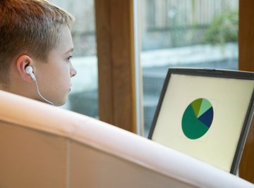
You must select a type of chart based on the type of information you wish to present. Some data lends itself to a specific kind of chart. Pie charts, for example, are especially useful to show percentages or to display the size of parts that make up a whole. A line graph shows trends over time, which includes a series of points connected with lines. You can use a line graph to show how tall a plant grew over the course of seven days, for example. Bar graphs use vertical or horizontal bars to show values for each bar, such as how many people walk, take the bus, or ride in a car to school. Pictograms are like tally charts that show numbers of some data. You can create a table to display number data. You can turn some tables into scatter diagrams, which show the relationships between two variables, such as the comparison between math and English test scores.
Creating a Chart
When you make your chart, you must consider the variables. In an experiment, the independent variable is what you purposefully change, such as the amount of water a plant gets. You change the independent variable to see how it affects the dependent variable. For charts, such as line graphs and bar charts, place the independent variable on the x-axis -- or the bottom, horizontal side of the chart --and put the dependent variable on the y-axis -- or the left, vertical side. For example, if you studied how the amount of water affects plant growth, make a line graph and put the height of the plant on the y-axis and the amount of water on the x-axis. Similarly, scatter diagrams will have one variable on each axis, such as math scores on the x-axis and English scores on the y-axis.
Highlighting Components
To put the finishing touches on your chart, give it a title and make sure you have labeled everything. While the picture component of a chart is great to look at, your audience needs to understand what information you’re presenting. Unless your chart is a table, label the title underneath the chart. Keep titles brief but informative, such as “Plant growth with varying levels of water.” You can also put a brief explanation of your chart, only one or two sentences long, that explains what the chart shows. Always label the x- and y-axis with what they represent. Use a key to the side of pie charts to show which section of the circle represents which piece of information, and include percentages next to each pie piece.
References
- Vision Learning: Using Graphs and Visual Data in Science
- Monash University: Using Figures, Tables and Graphs
- Science Buddies: Data Analysis and Graphs
- BBC Bitesize: Representing Data
- The Math League: Using Data and Statistics
- JVC's Science Fair Projects: Variables: Independent, Dependent, Controlled
About the Author
Cara Batema is a musician, teacher and writer who specializes in early childhood, special needs and psychology. Since 2010, Batema has been an active writer in the fields of education, parenting, science and health. She holds a bachelor's degree in music therapy and creative writing.
Photo Credits
Ableimages/Photodisc/Getty Images