Hello there!
Welcome to Hunker, a destination for the design-curious. It’s a place to discover new artisans, muse about microtrends, explore fascinating design histories, and peer into the spaces of interesting people with unique aesthetics.
Join our community by signing up for our newsletter, a weekly digest on design.
We’re glad you’re here.
Featured

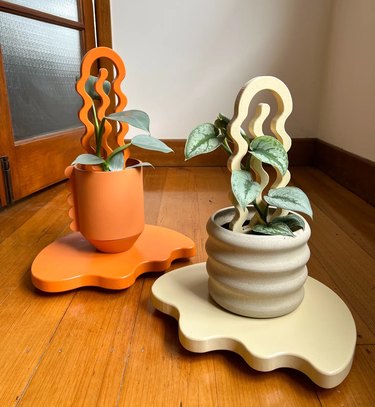
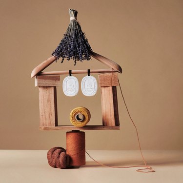
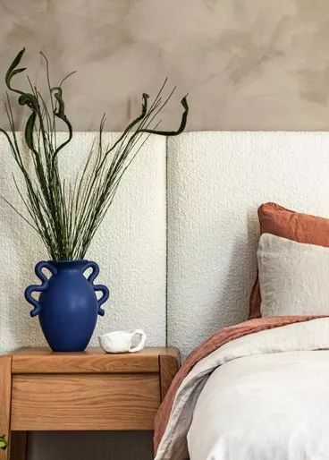
In Focus: Here's the Thing
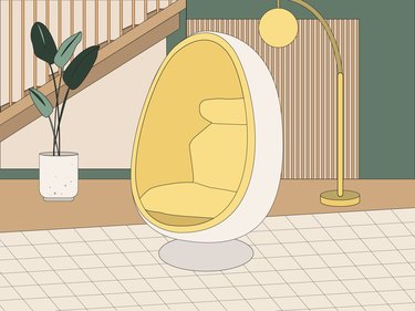
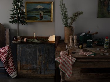
House of Good
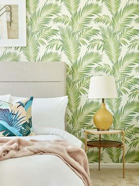
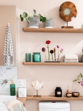
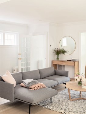
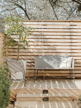
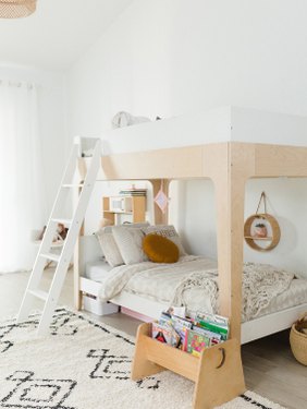
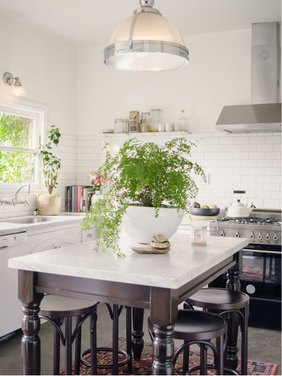
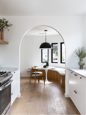
Our ever-changing home in Venice, CA.
More Stories

In Partnership with
Celebrity Cruises

Design
In Partnership with
Celebrity Cruises

Design
In Partnership with
Celebrity Cruises

Design
In Partnership with
Celebrity Cruises

Design