Think about a neutral color palette, and your brain may go a few different directions — either bored by the simplicity or calmed by its soothing nature. Neutrals are the cornerstone of most home decor color schemes, though. And many interior designers consider them pivotal to creating harmonious living spaces. Best yet, shades of white, black, gray, and greige never go out of style, so neutral decor will look just as fresh a decade from now as they do today.
However, these versatile shades have a tendency to get overlooked as only accent colors, since they oh-so-kindly allow bright, bold Roy G. Biv hues to steal the spotlight. But here's a thought: What if your entire room consisted solely of different shades of neutrals featuring cool and warm undertones? They can be just as beautiful as any other color combination. You simply have to pay attention to texture, shape, and volume.
Video of the Day
Video of the Day
But before you break out the paintbrushes, here are some neutral color scheme basics to keep in mind.
What are the neutral colors?
The four most common colors interior designers typically turn to are black, white, gray, and brown. However, beige, taupe, and even some pastel color choices can be considered neutrals, too.
Which colors pair well with neutrals?
Trick question: All shades — from bold colors to earth tones — pair well with neutrals. That's why these hues are so important in all aspects of design, from fashion to typography to makeup to, of course, interiors.
Which rooms would benefit from the neutral color trend?
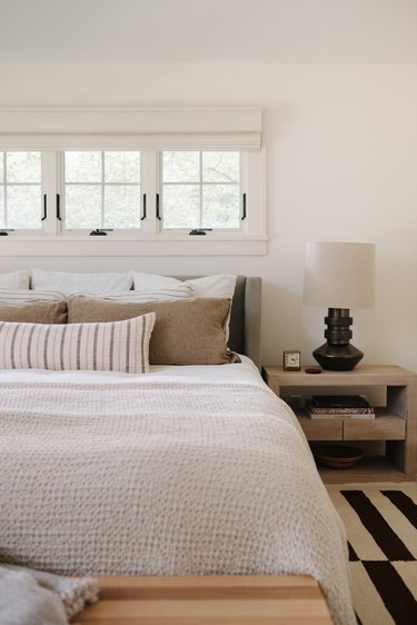
Any room can be charming in a neutral color palette. A neutral bedroom would create a relaxing space to start and end each day, while a similarly-hued living room would be a sophisticated space to entertain.
Convinced yet? You will be. Scroll on for 10 neutral color palette ideas that we love and know you will too.
10 Neutral Color Palette Ideas
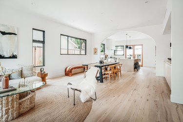
1. White + Beige + Black
This room is a beautiful lesson in warm neutrals. The designers at Prospect Refuge Studio created this easy-on-the-eyes sleeping space and made layering seem like a breeze. Want to recreate the look? Start with the bed: White linens are topped with row after row of tonal and patterned pillows (varying the shapes and sizes is very important) then finished with a textured beige throw. That neutral palette allows the touches of matte black — in the graphic rug and bold lamp — to pop and the textures — like the nubbiness of the throw — to stand out.
2. Taupe + Natural Wood + White
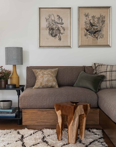
Stare at a neutral color palette long enough, and the nuances between tones become more apparent. Exhibit A: this gorgeous living room scene designed by Heidi Caillier. The taupe hue suddenly takes on an eggplant tint, while the natural wood pieces, especially the live edge side table, look variegated. When one color isn't standing out, they all stand out.
3. Slate + Walnut + Stainless Steel
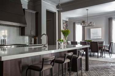
While a neutral color palette can often make for a light and bright room, a combo of moody neutrals has an entirely different effect. Look to natural materials for inspiration, like slate, wood, and stainless steel, as seen in this culinary space designed by Marie Flanigan Interiors. Kitchen materials tend to be sleek and smooth, so be sure to add texture where you can, whether that's via tile, barstool upholstery, or flower arrangements.
4. Marble + Bronze + Alabaster
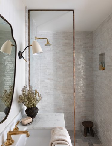
Don't you feel relaxed just looking at this dazzling bathroom design by Amber Interiors? Of all rooms to implement a neutral color palette in, a bathroom should be your first stop, since it's the smallest room with the biggest impact. Here, shades of white and gray are seamlessly melded with bronze accents. You can focus on the textures, the glistening tiles, and the sleek lampshade. And while it's easy to get caught up in the big picture features, like the tiles and countertop, be mindful not to botch the neutral palette by overlooking the little details.
5. Black + Bronze + Warm Wood
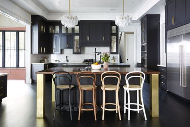
With this polished kitchen, Black Lacquer Design shows us how to create a rich neutral color palette that's nothing short of glamorous. There are fundamental elements: black cabinetry, a marble backsplash, and an oversize wood-topped island with brass legs. But we especially love the unexpected items, like opulent chandeliers and mix 'n' match barstools, which add cheekiness and levity to the space.
6. Ivory + Cocoa + Various Shades of Wood
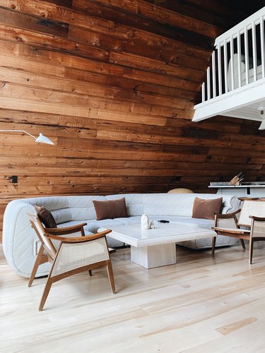
Here, Lilla Norr — a rentable A-frame in Minnesota — nods to Scandinavian decor and a neutral color palette. With the entire cabin decked out in natural wood and shades of ivory, your eye is able to focus on the beauty of shapes and textures, from the roundness of the sectional to the hard angles on the travertine coffee table — and, perhaps most importantly, the deer prancing outside the windows.
7. Terra Cotta + Tan + White
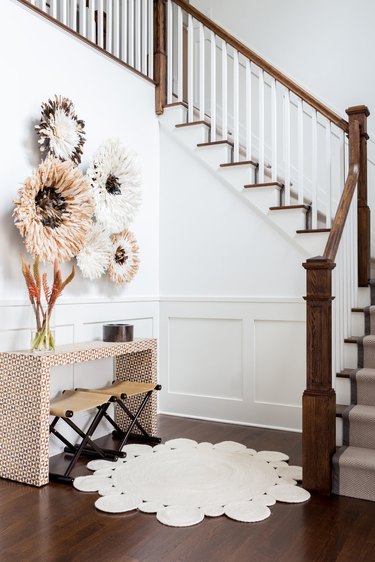
If you're working with a lot of bright white paint, say in a grand staircase/entry/hallway area, you may be wondering where to even begin decorating. We say bring in small doses of warm neutrals like terra cotta and tan. Here, Chango & Co. shows how it's done by emphasizing scale and pattern instead of rainbow-like hues. Going the all-neutral color inspiration route makes for an easier transition from space to space.
8. Pearly White + Blue-Gray + Natural Wood
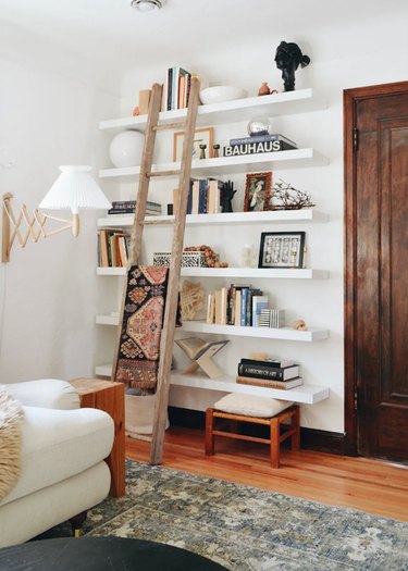
When creating this library wall, DIYer Erin Francois of Francois et Moi added floor-to-ceiling floating shelves that are painted the same white color as the wall and ceiling to make them feel like built-ins. Then, to style, she layered books and beloved trinkets, all in varying shades of neutrals, so not one thing stands out too much. Instead, the entire wall feels cohesive, especially when surrounded by the natural wood elements. The only hint of color? The beautiful blue-gray rug, which features plenty of pearly white to complement the walls.
9. Gray + Sand + Eggshell
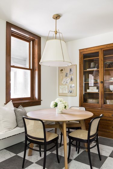
Leave it to Studio McGee to design a relaxed, not too complicated dining space that would make all three meals of the day — plus Zoom calls! — all the more delightful. It's layered with neutrals but not even close to boring. The checkerboard floor grounds the space with a graphic punch, while the pillows, in shades of gray and eggshell, adds softness. The table stands out for its sweet round shape.
10. White + Tan + Light Blue
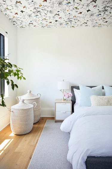
Yes, there are small jolts of color in the ceiling wallpaper of this sweet-as-can-be kids' bedroom. Still, this design by Tara Cain Design proves color in a little one's space can be subtle. Case in point: the palest blue pillows paired with white walls and tan baskets (baskets: a must for storage). Kids are constantly bombarded with color and stimulation, so aim to provide a space for them to relax, play, and sleep with a calming color palette. Bits of vibrancy here and there are okay; just don't go overboard.