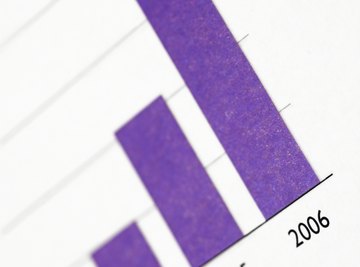

A histogram is a graphic presentation of data. While the same information can be presented in tabular format, a histogram makes it easier to identify different data, the frequency of its occurrence and categories. It has two axis, one horizontal and the other vertical. Another name for a histogram is a bar chart.
General Synopsis
The general purpose of a histogram is to present an easily understood summary about certain data; it can be almost any type of data. The written data is transposed onto a chart that has vertical blocks; the number of blocks depends on the categories of data collected. For example, if you are measuring the frequency of something that occurs in a week you would have seven sections along the horizontal line. The vertical line has numbers indicating how many times the event occurred.
Statistical Purpose
Using data presented in the histogram, you can determine statistical information. This includes the mean value – the average across all the blocks; the maximum value – the highest block; and the minimum value – the lowest block. The number of blocks determines the number of items you are measuring, such as months in a year. The top of each block lines up to a number on the vertical line and may determine frequency.
Trends
Histograms track trends. For example, if you have split the horizontal line into 12 sections representing January through December and the vertical line is split into temperatures, you can see the trend of temperatures during the year. Another example is having sections on the horizontal line representing years and the vertical line representing household income. As the income data is put onto the histogram, you see a trend.
Data Distribution
There are several common types of histograms, based on data distribution. The term “normal” is applied when the shape of the histogram rises until it reaches the center block and then falls again. “Cliff-like” can be applied to a histogram when the first block is the highest and the height of each subsequent block is shorter than the preceding one. “Skewed” applies when the blocks rise, but then fall, before reaching the center of the blocks, while a “plateau” is a histogram that has generally high blocks that are similar in height.
Weaknesses
Histograms have many benefits, but there are two weaknesses. A histogram can present data that is misleading. For example, using too many blocks can make analysis difficult, while too few can leave out important data. Histograms are based on two sets of data, but to analyze certain types of statistical data, more than two sets of data are necessary. For example, the blocks may denote the number of months in a year and the vertical line, the number of students attending college each month. However, it doesn’t tell you the number of male and female students.
References
About the Author
Stephen Benham has been writing since 1999. His current articles appear on various websites. Benham has worked as an insurance research writer for Axco Services, producing reports in many countries. He has been an underwriting member at Lloyd's of London and a director of three companies. Benham has a diploma in business studies from South Essex College, U.K.
Photo Credits
Thinkstock/Comstock/Getty Images